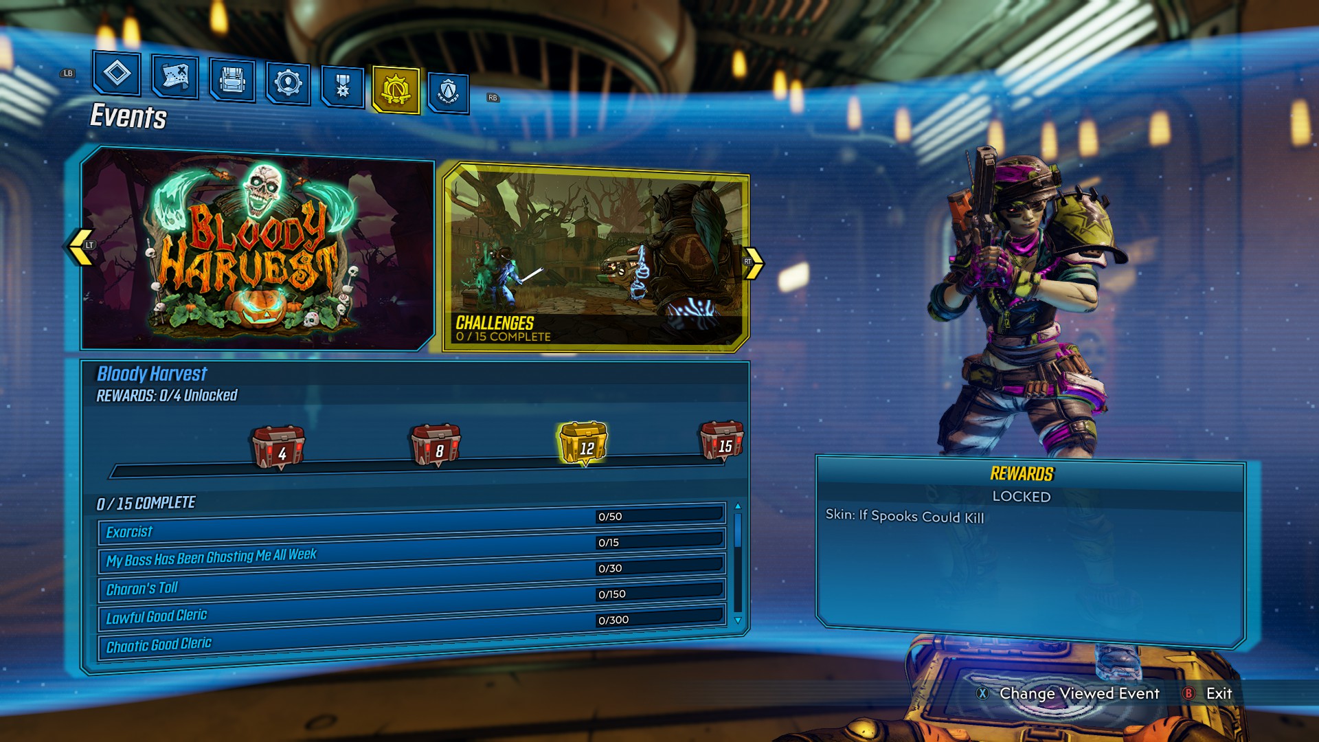
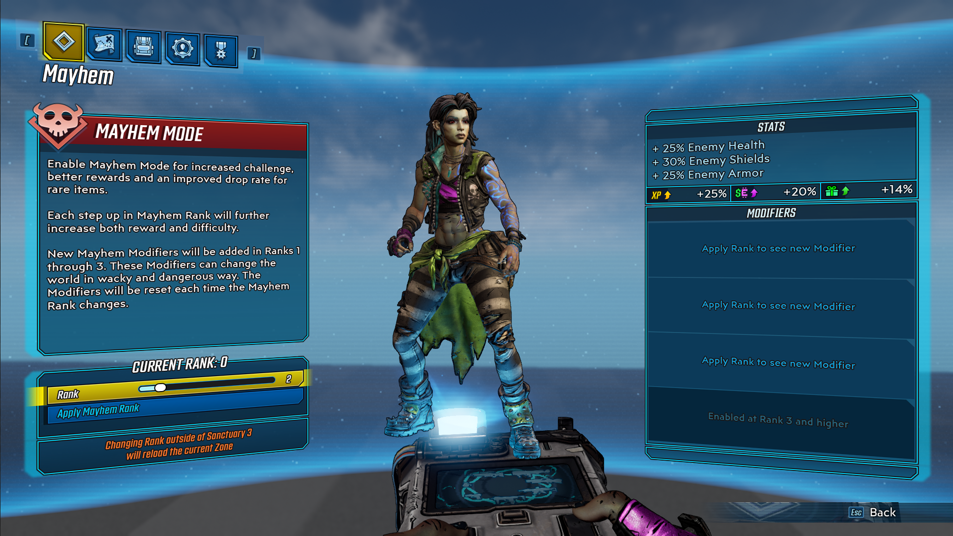
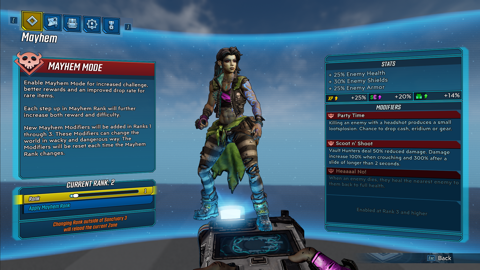
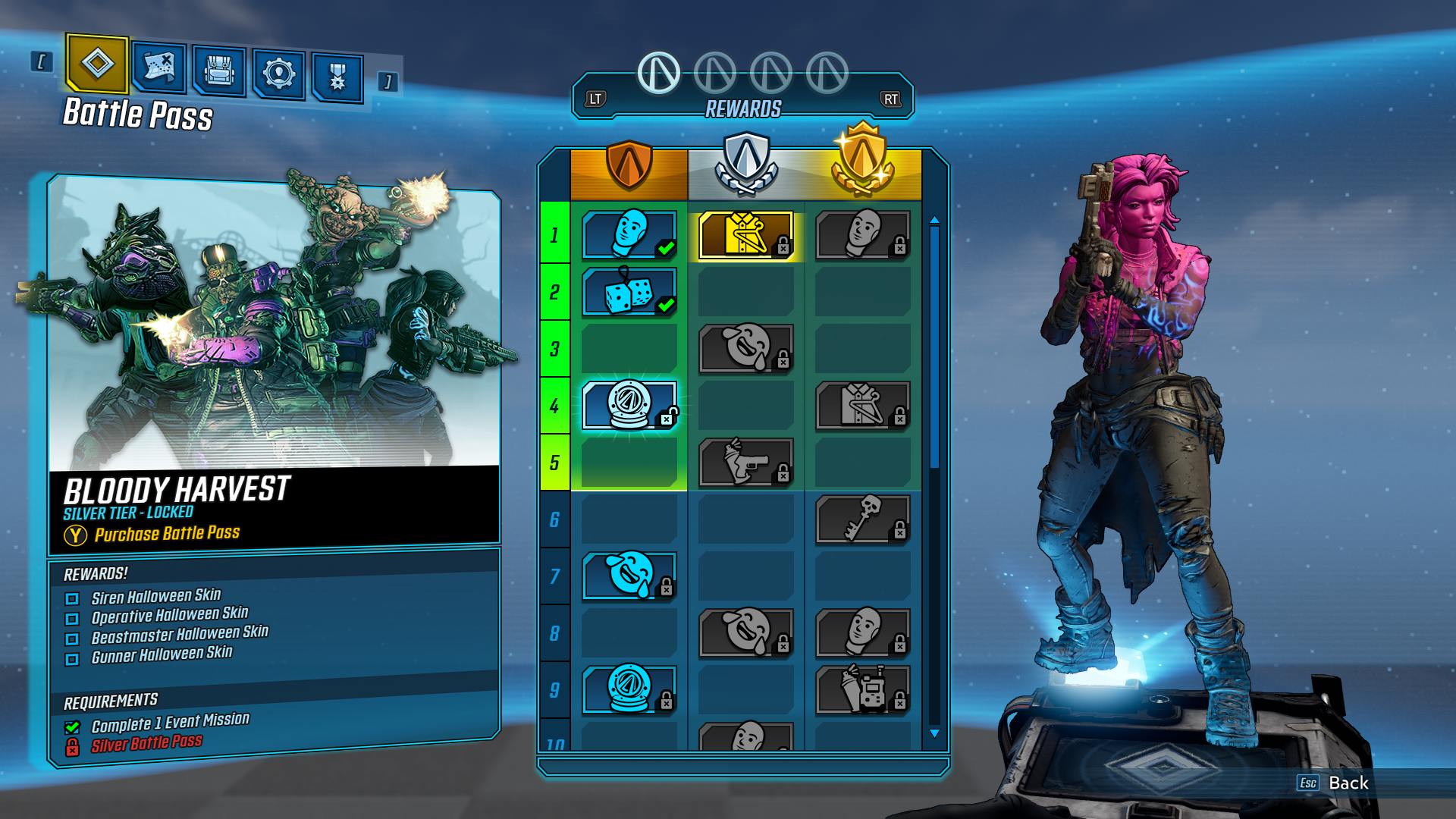
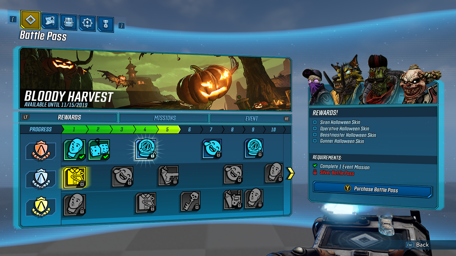
Borderlands 3 is the latest installment in the main Borderlands series and the first created in Unreal 4 for the Eight and Ninth generation of consoles. Borderlands 3 had significant UI needs, with various game modes, systems, new to the franchise features and extensive post-launch content. The inclusion of local co-op through splitscreen layouts combined with online multiplayer options required a very flexible interface design that could adapt as needed.
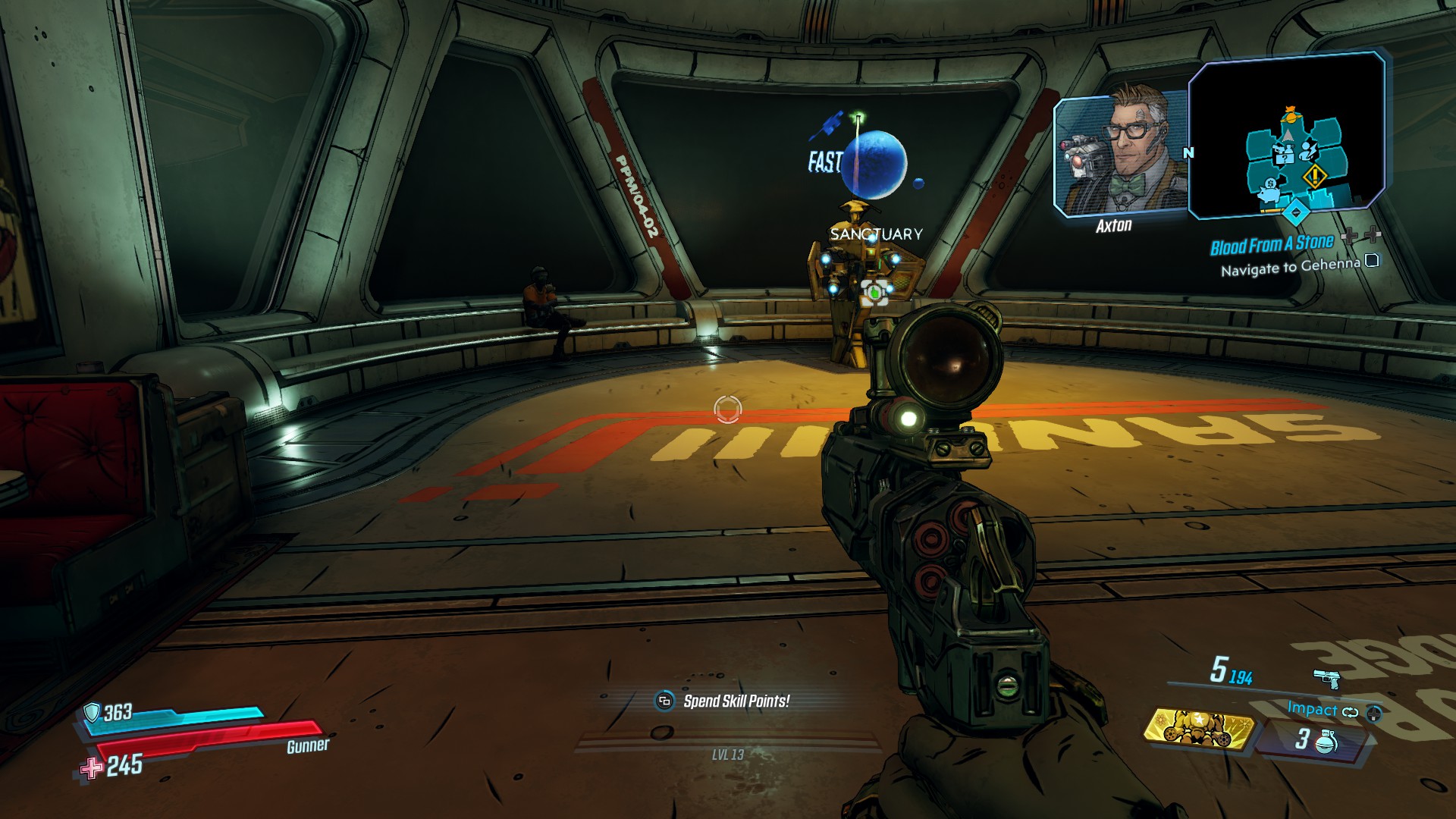
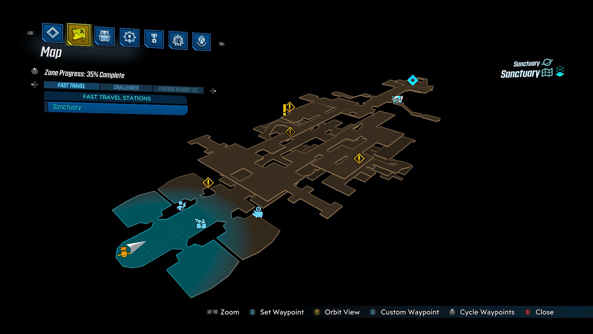
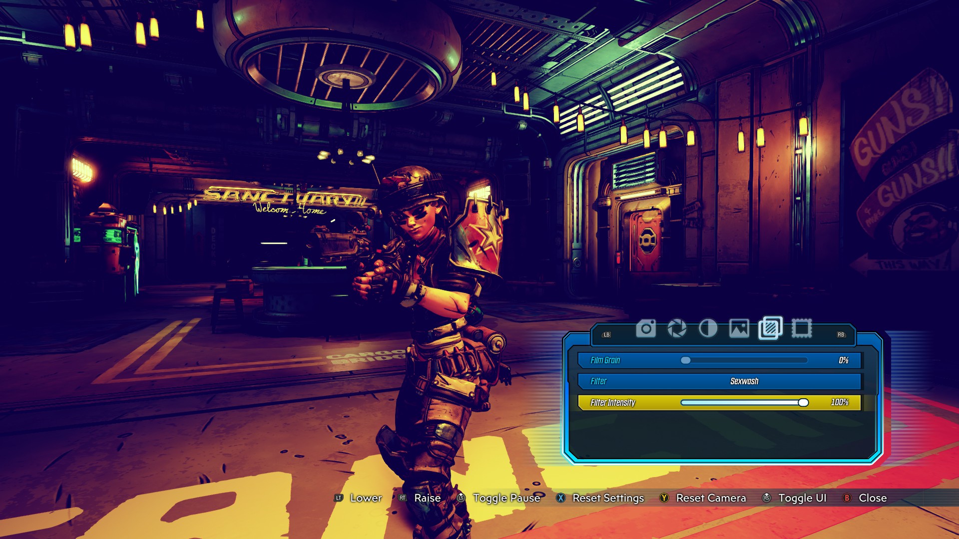
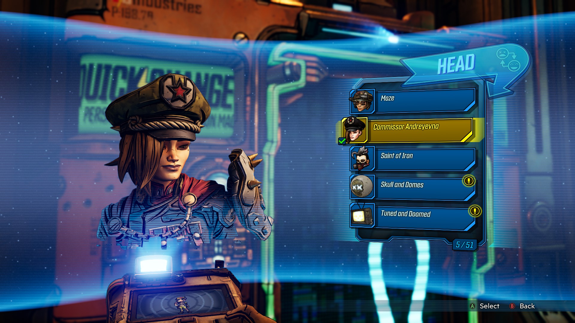
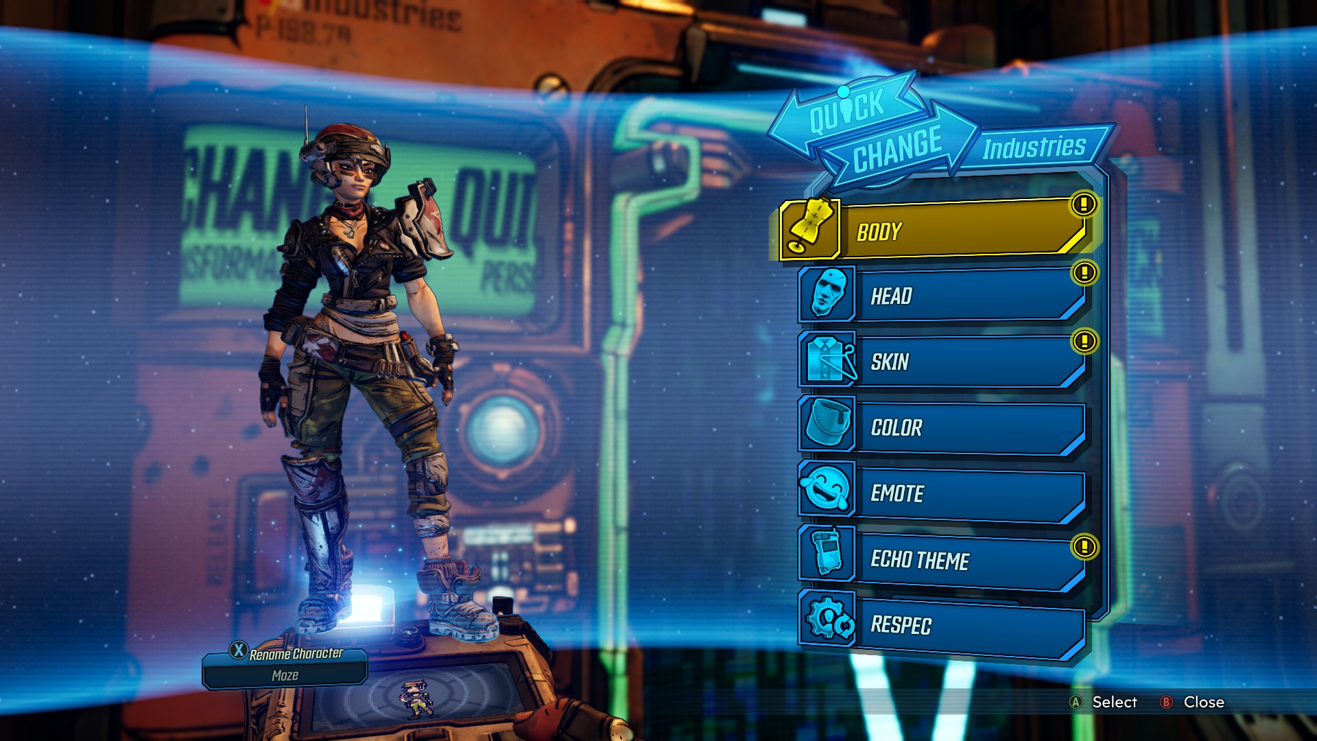
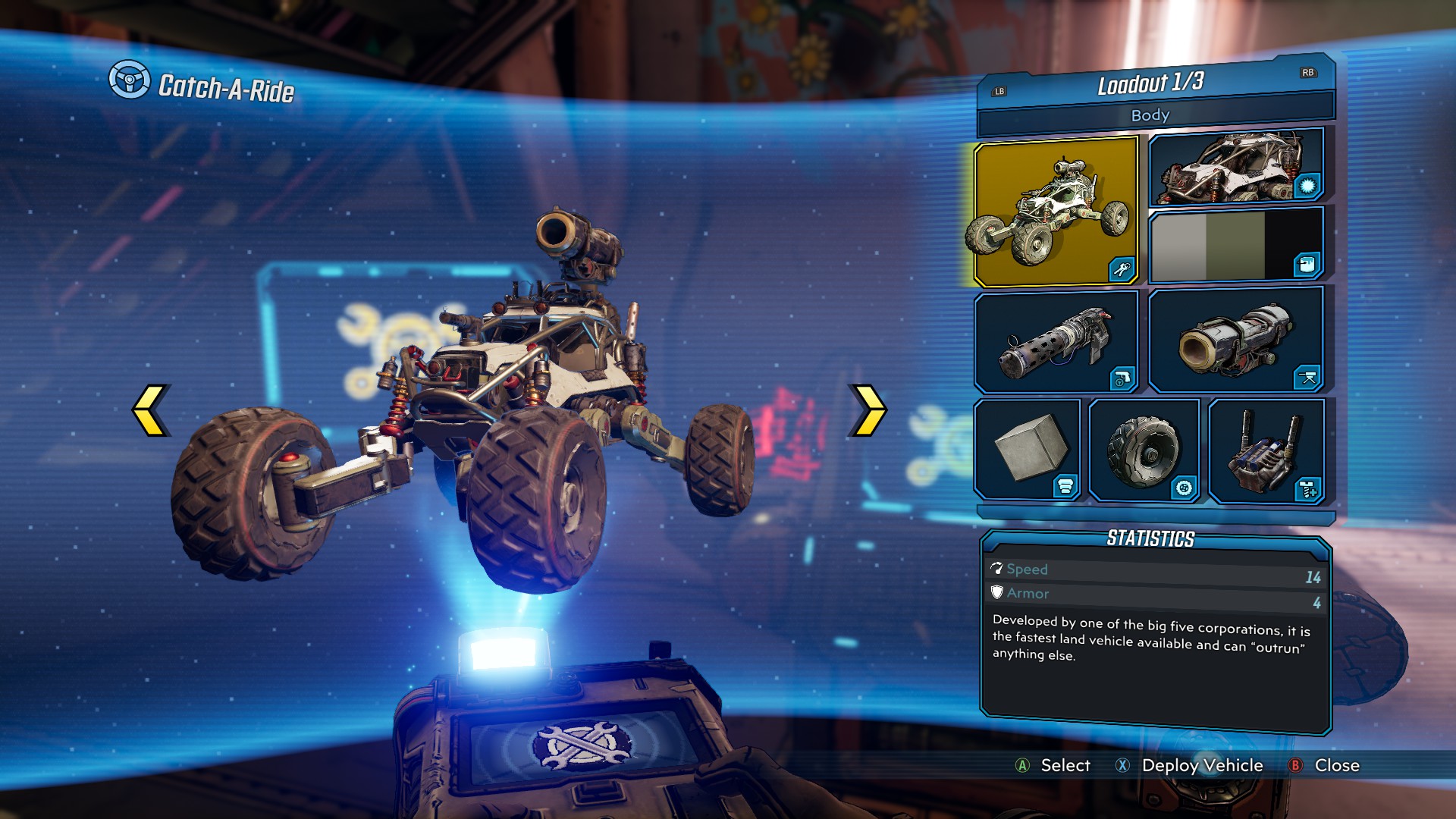
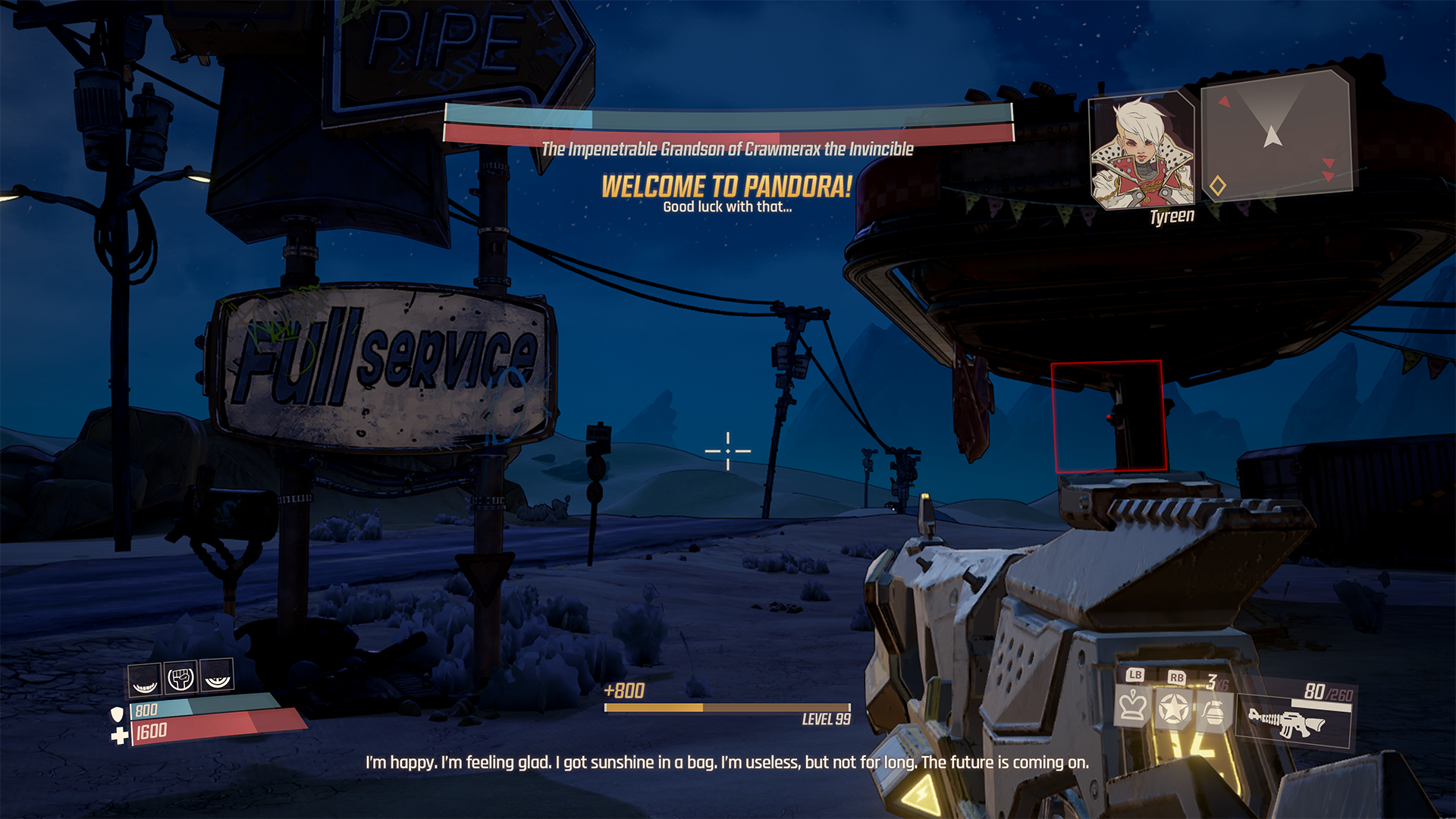
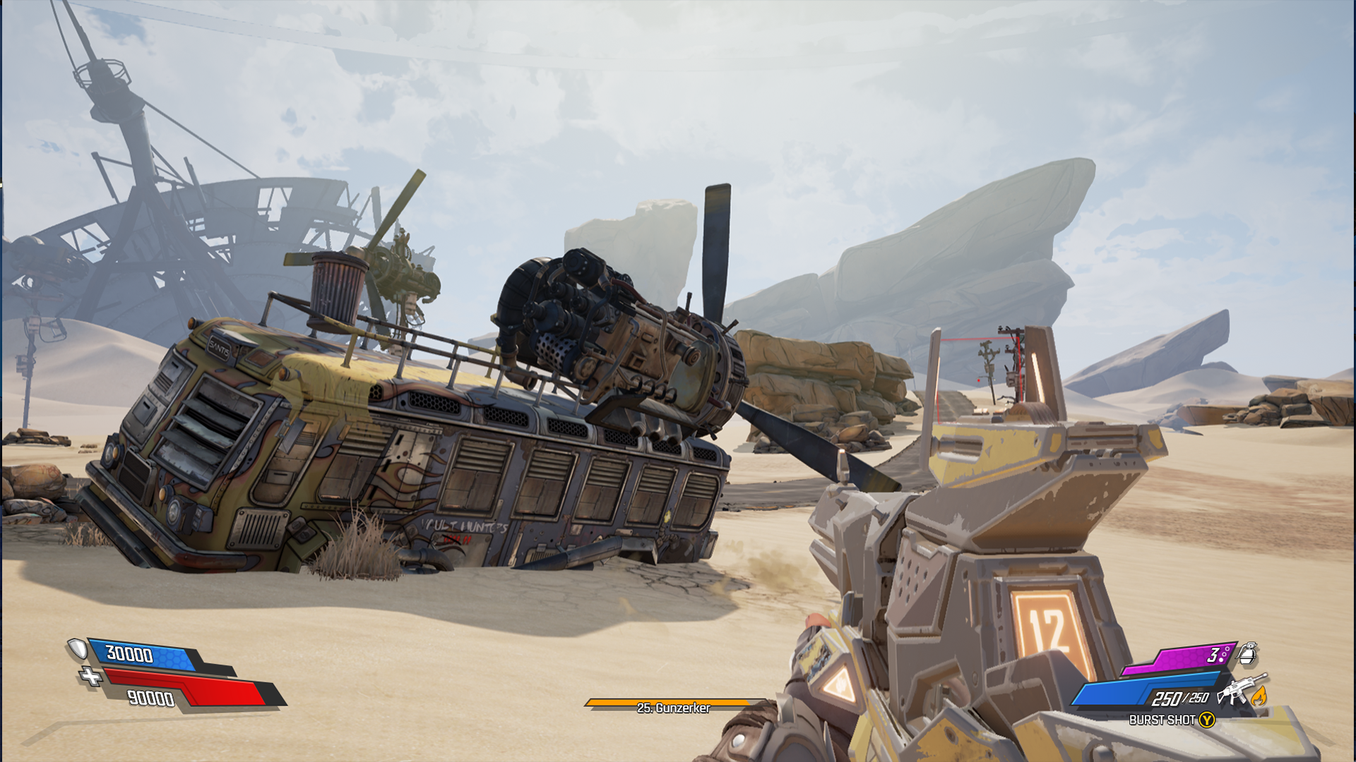
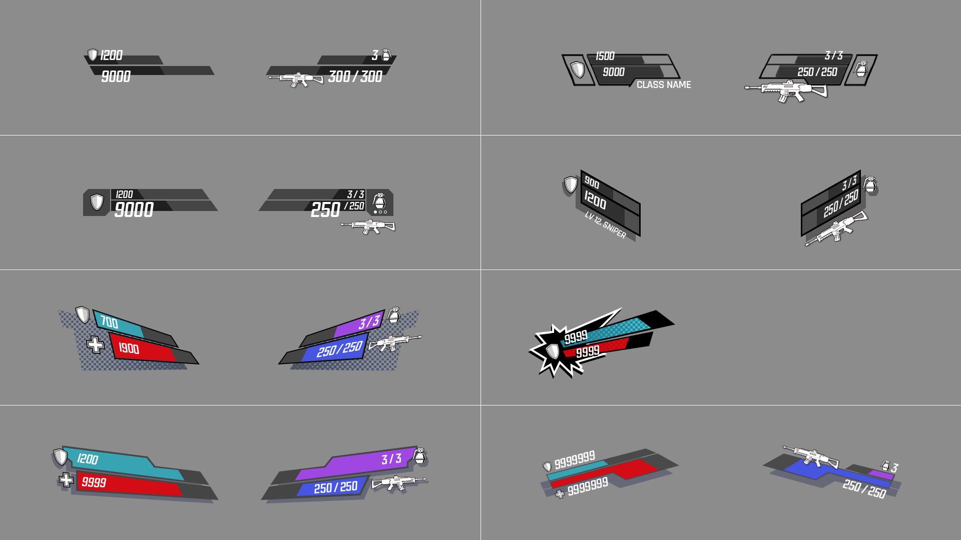
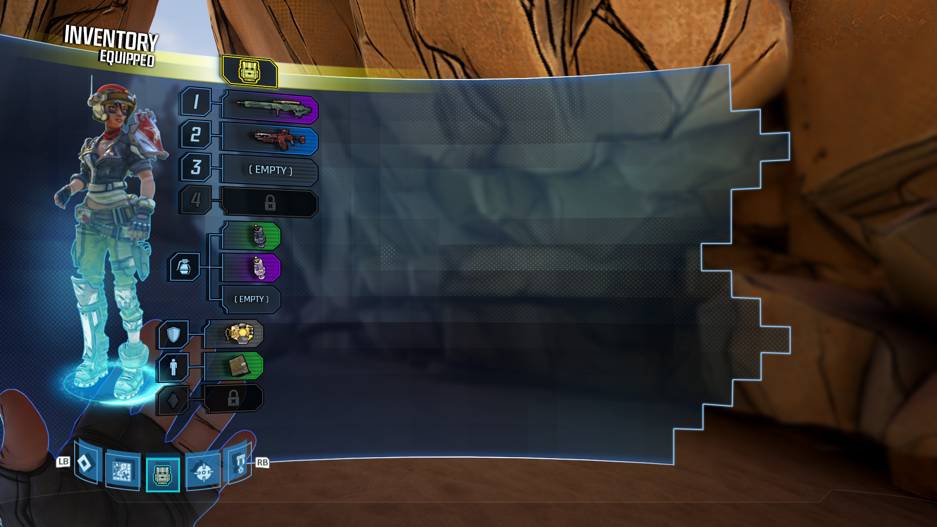
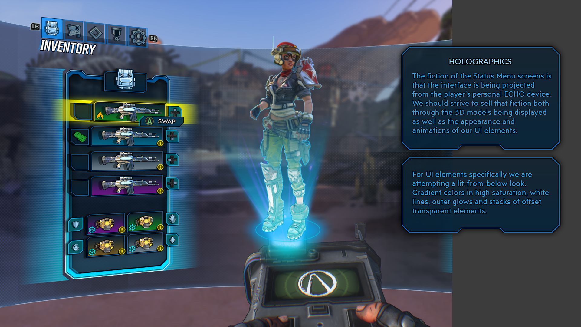
My main goal as the UI Art Leads was the create an interface design that felt consistent from screen to screen. We focused on an evolution of the Borderland 2 aesthetic with the holographic blue panels, glowing selection states, overlapping design elements and a 3D tilted perspective. The game incorporated a physical 'ECHO Device' this time around that was used to explain the projected nature of the UI. However we needed to ensure that the visual style worked in menus where the ECHO device could not be included, like the map screen, options menus and Photo Mode.
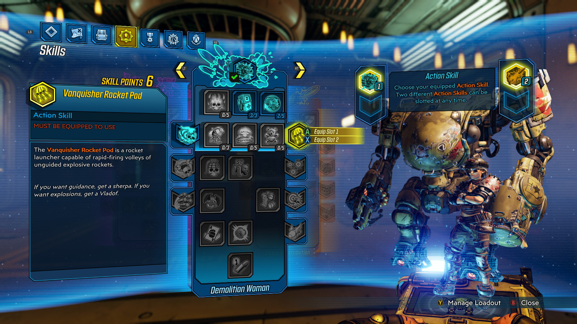
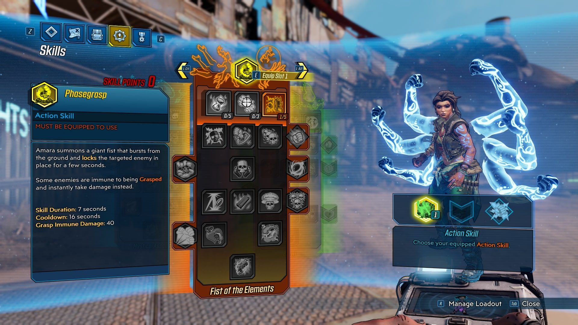
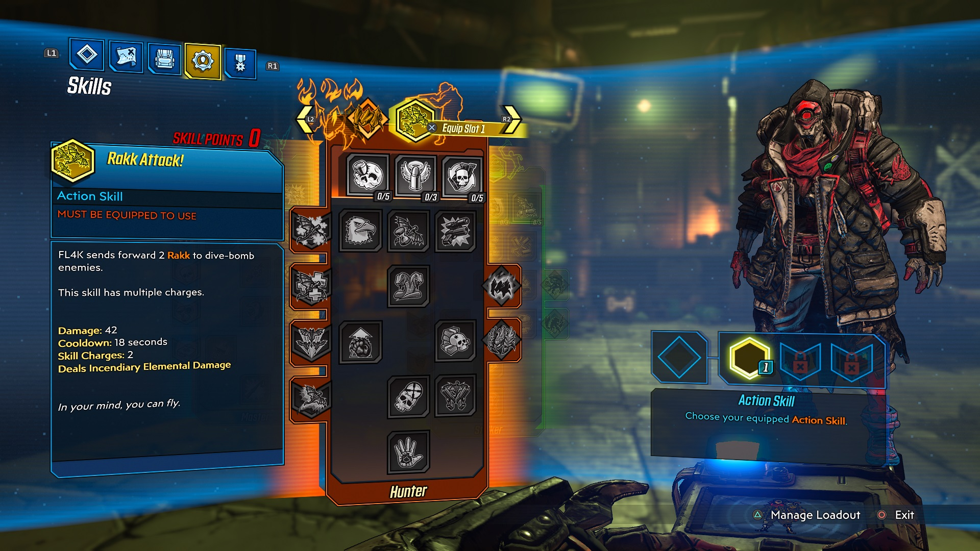
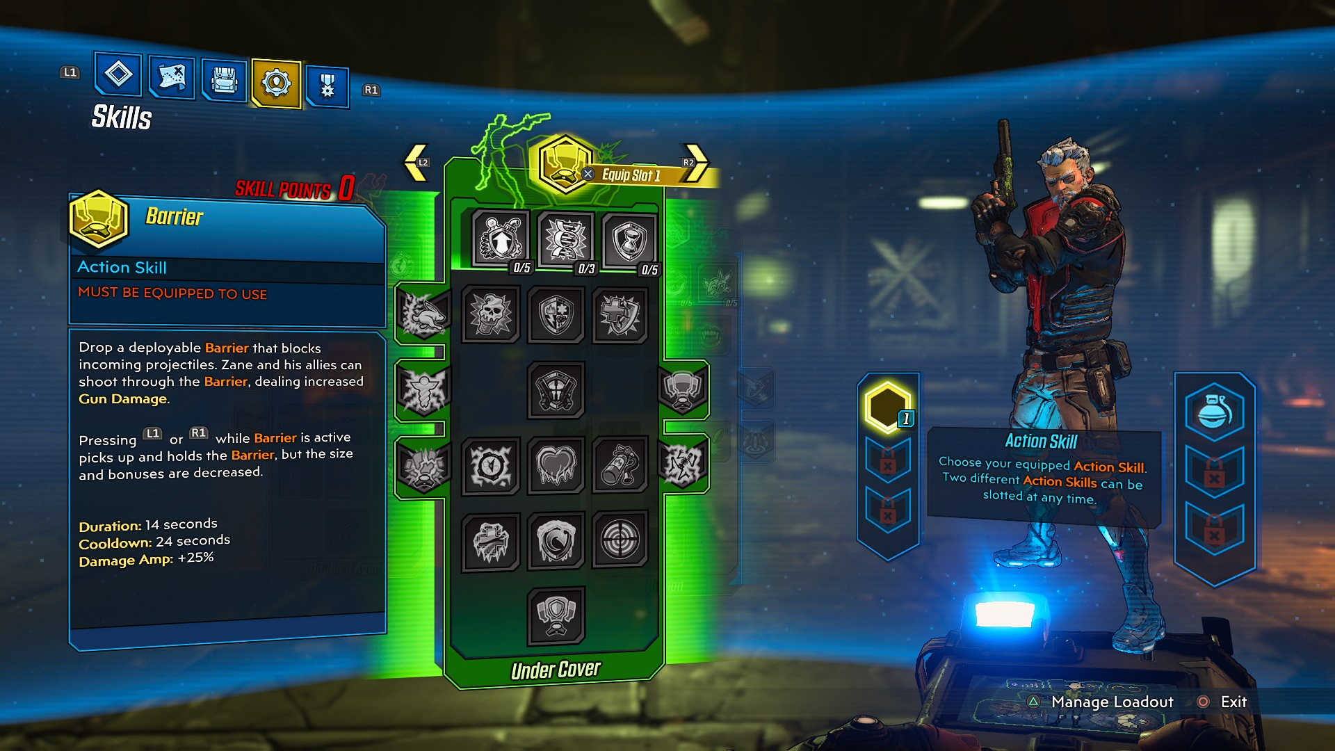
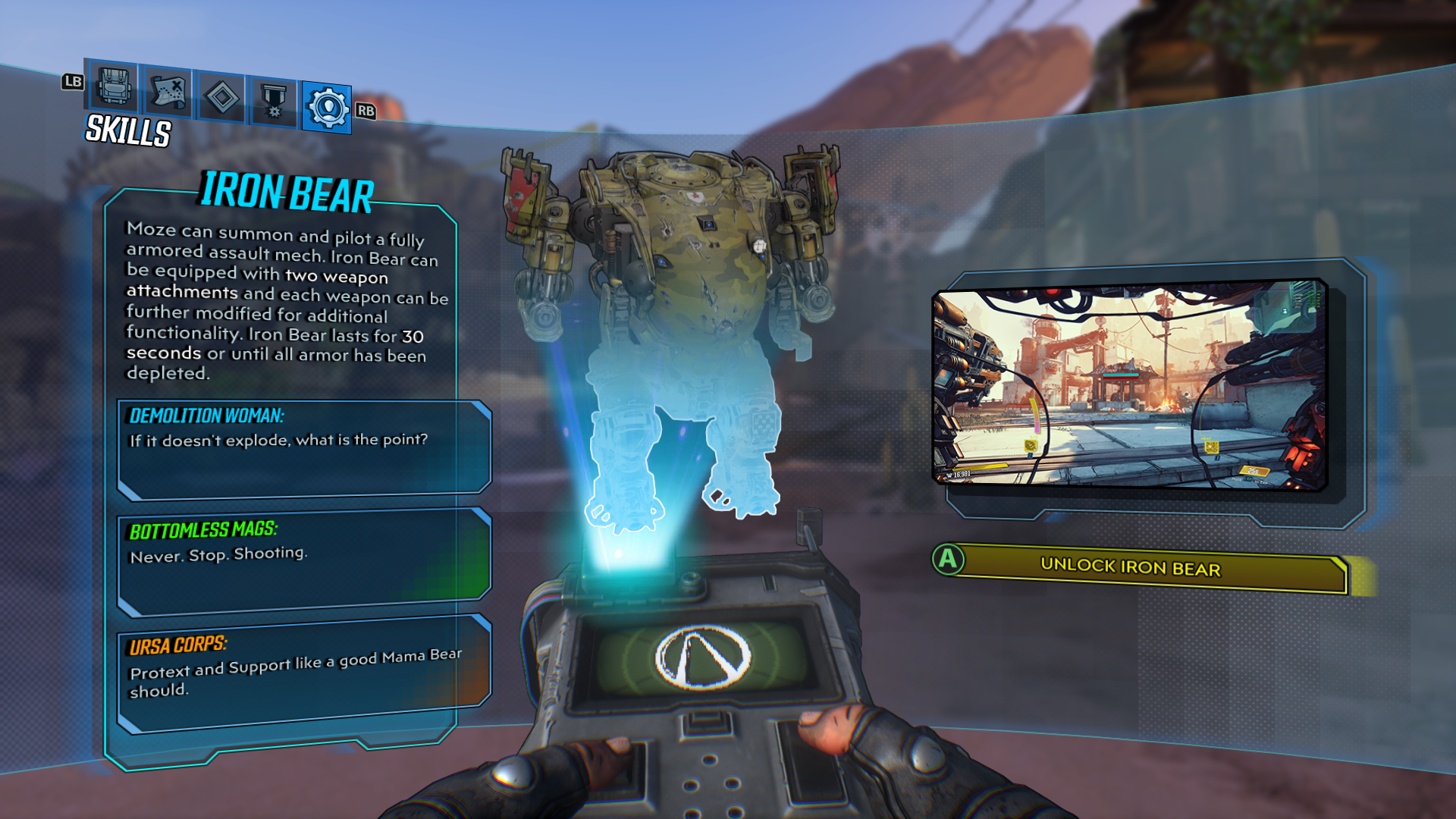
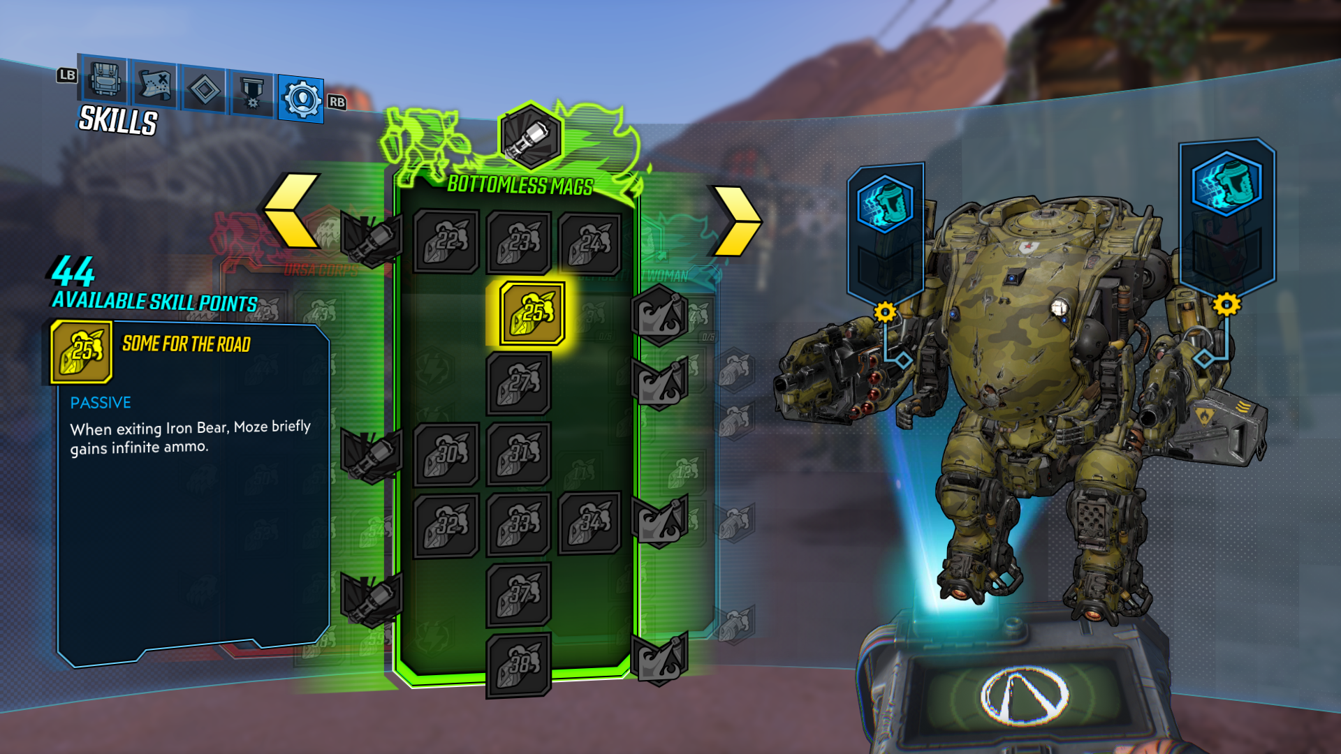
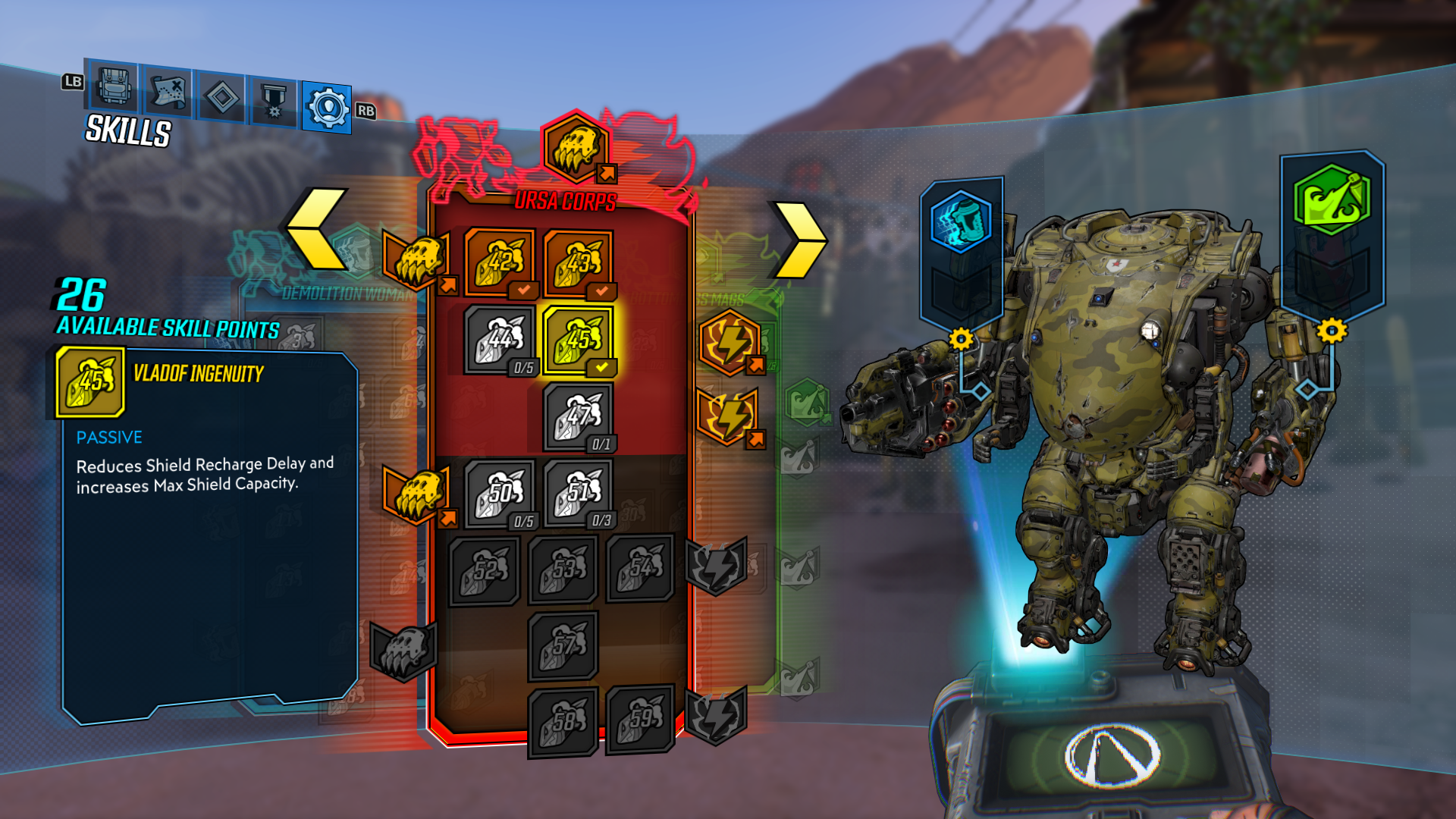
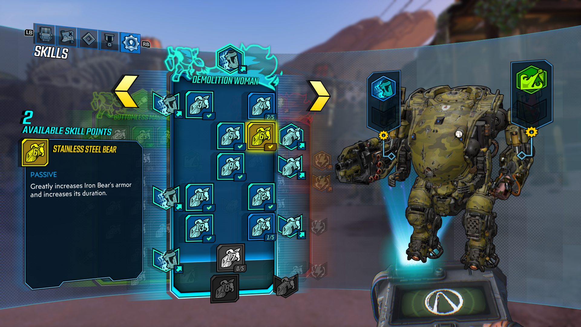
A large portion of my time was spent with the Character Skill screens. These screens needed to find a balance between feeling familiar to returning players while accommodating the many new features that the updated skill system required. An additional complication came from the fact that each of the four Vault Hunters had unique Skill loadouts that required different layouts and tutorialization. As part of my exploration, I created a fully interactive prototype of the Skill screen for early user testing.
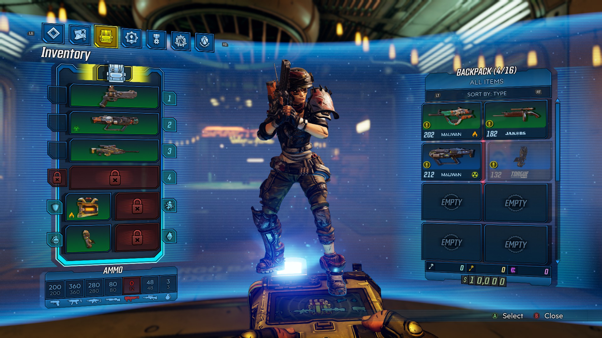
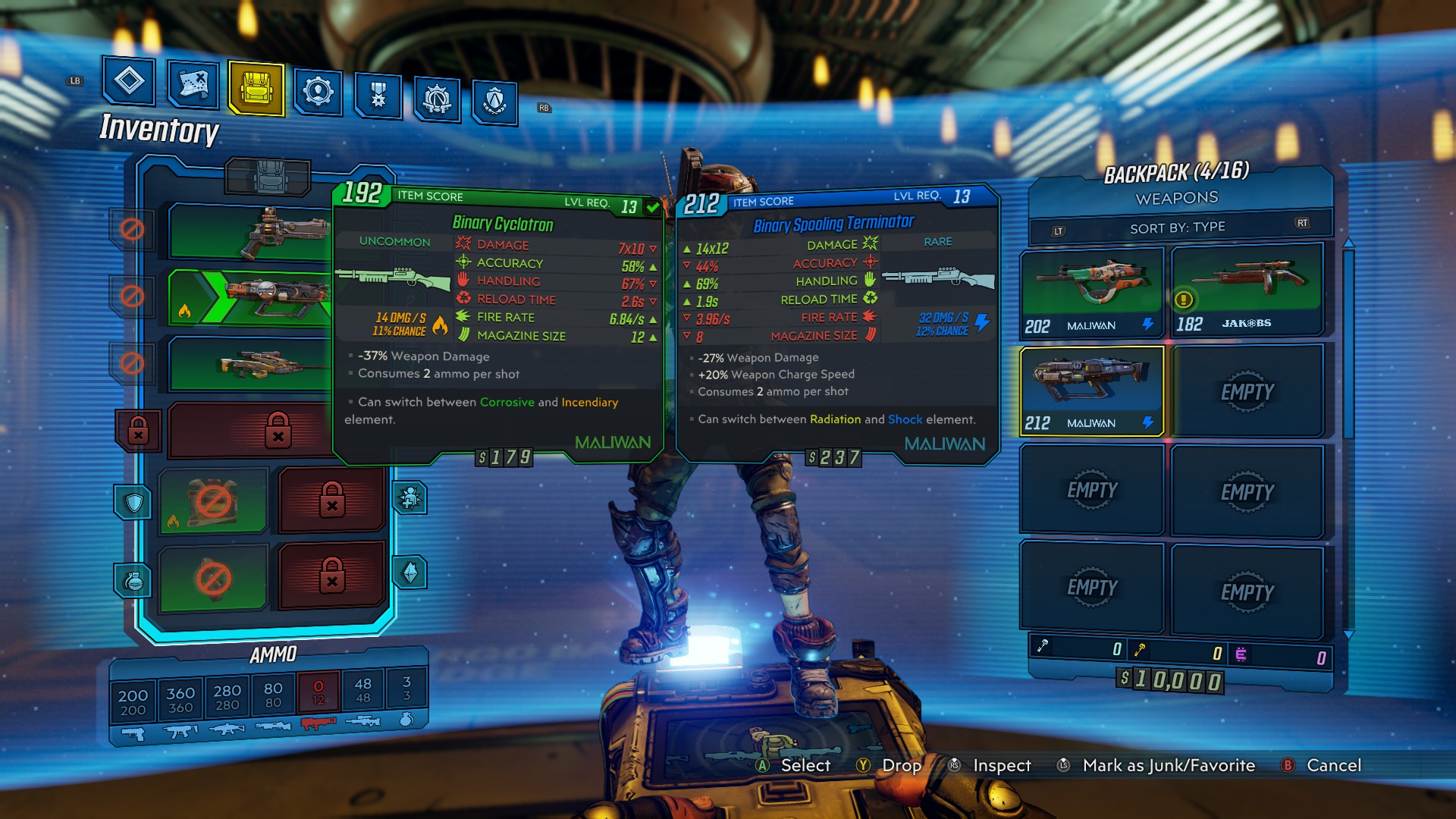
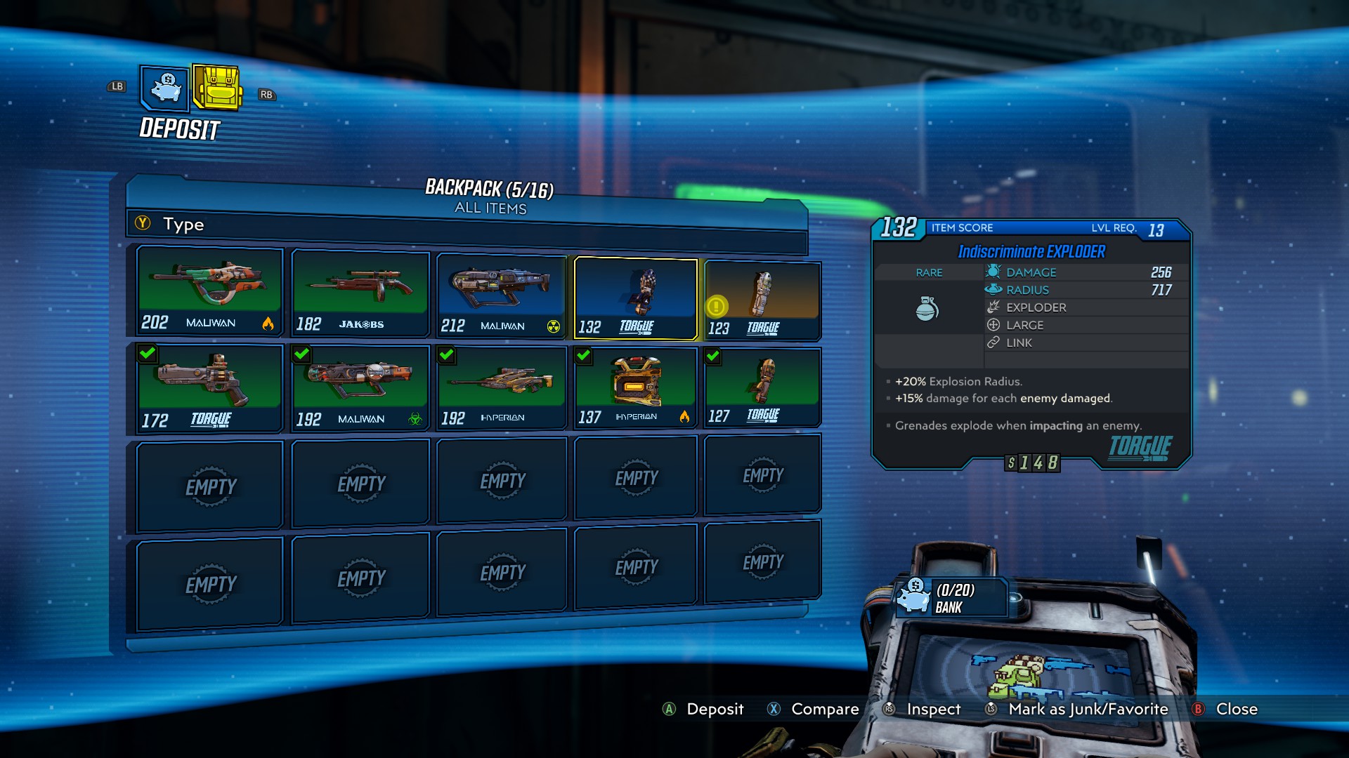
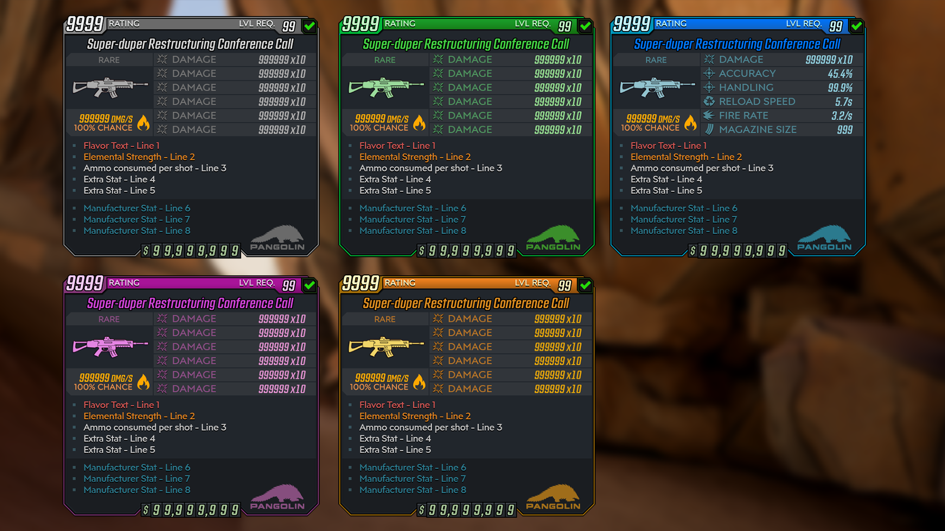
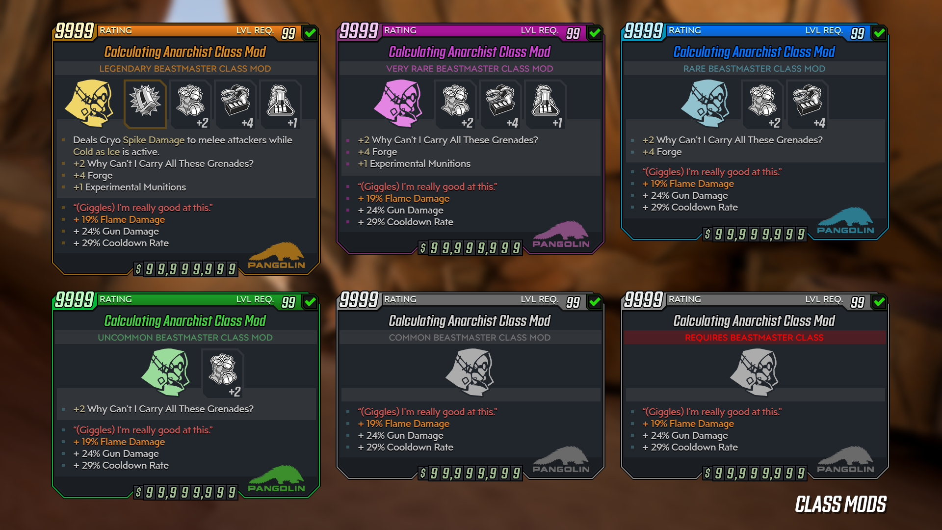
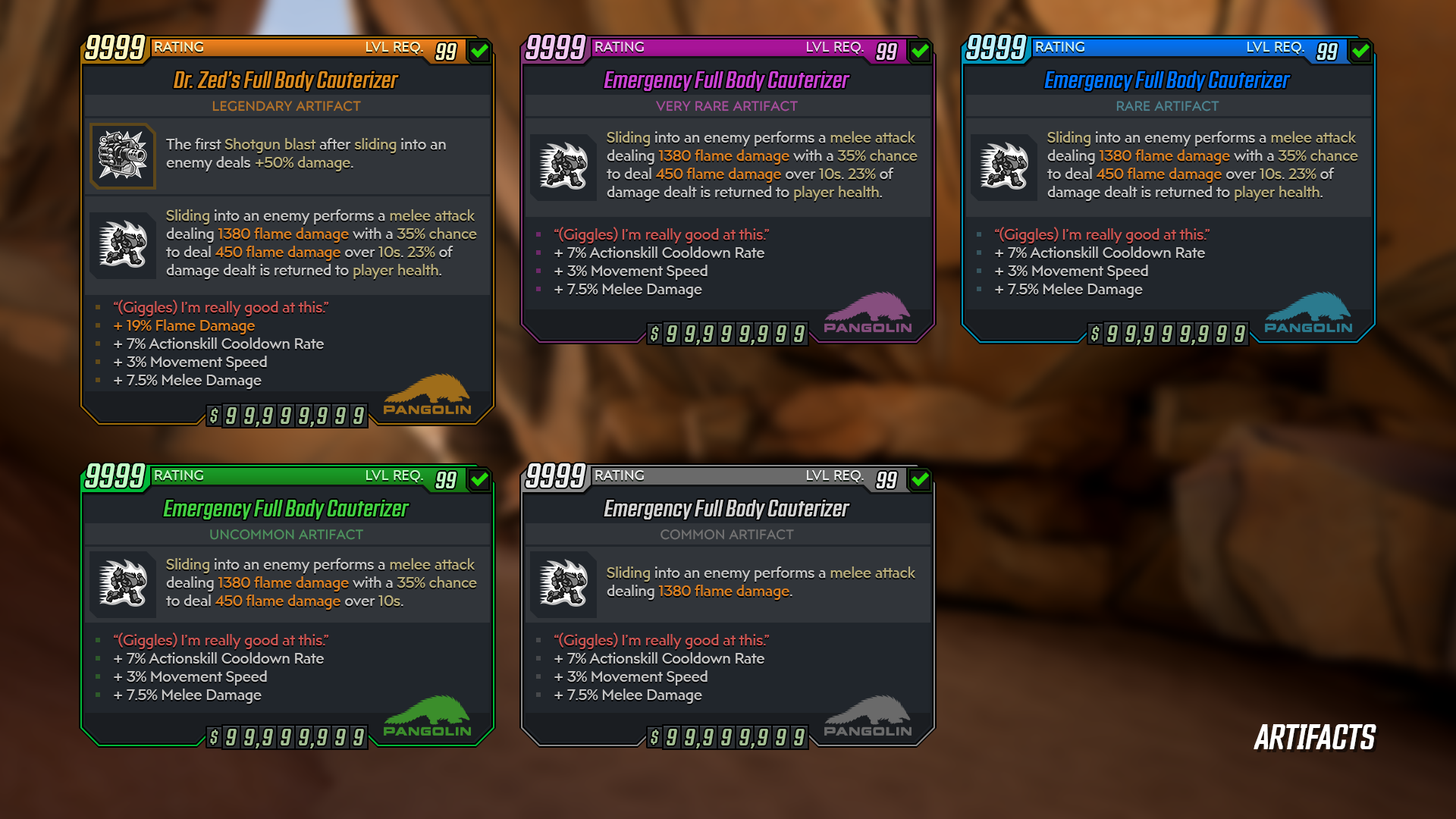
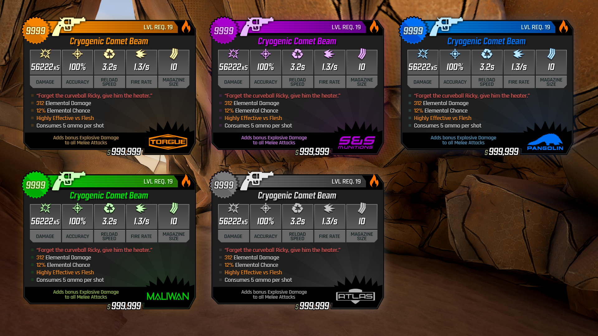
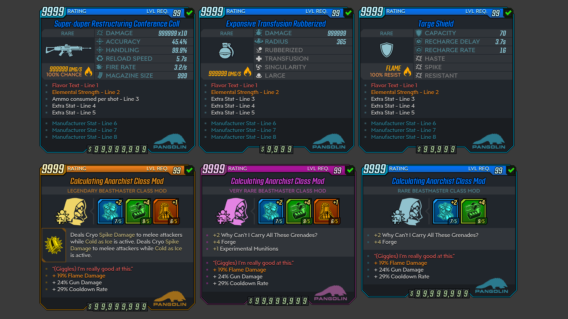
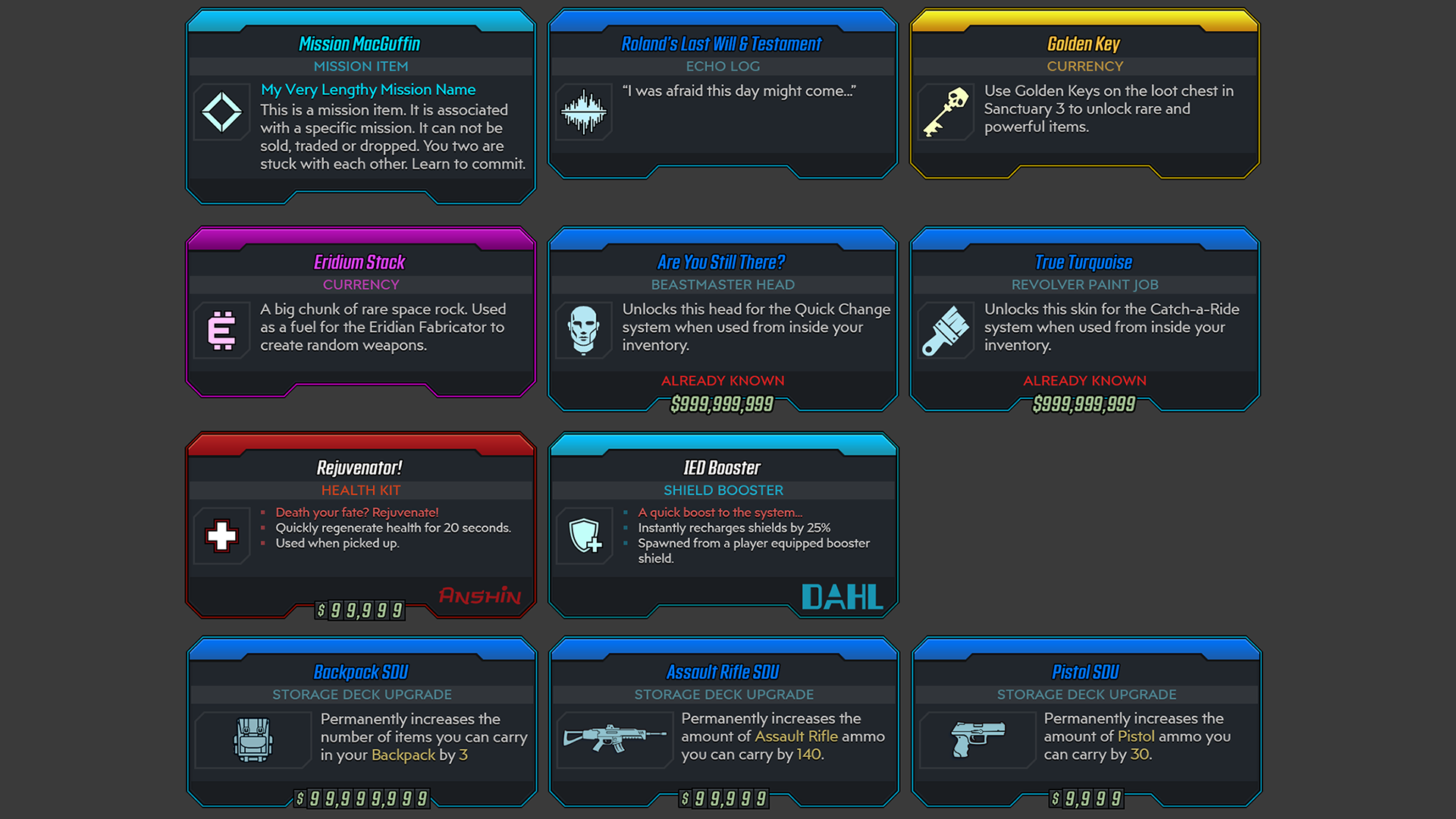
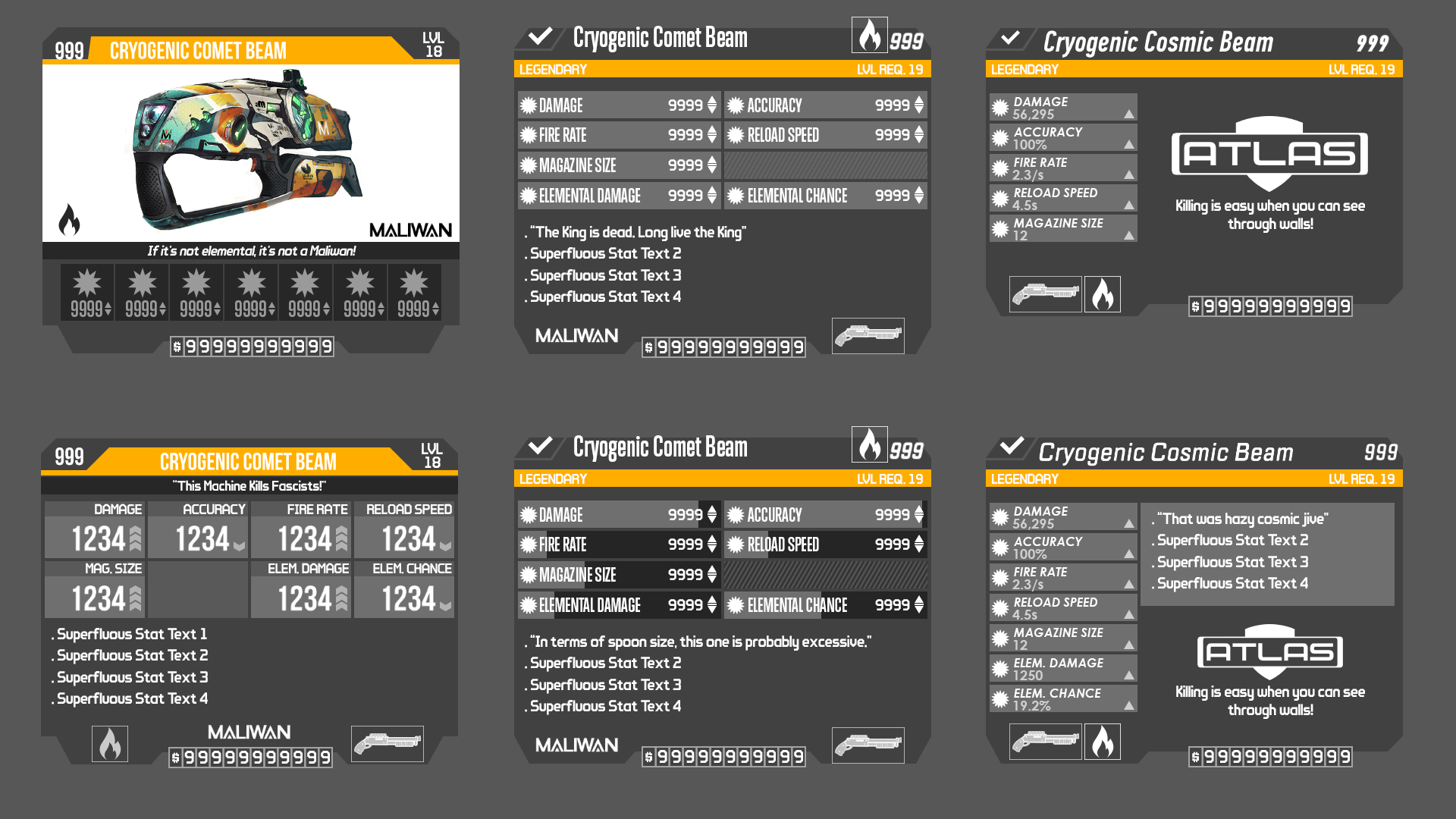
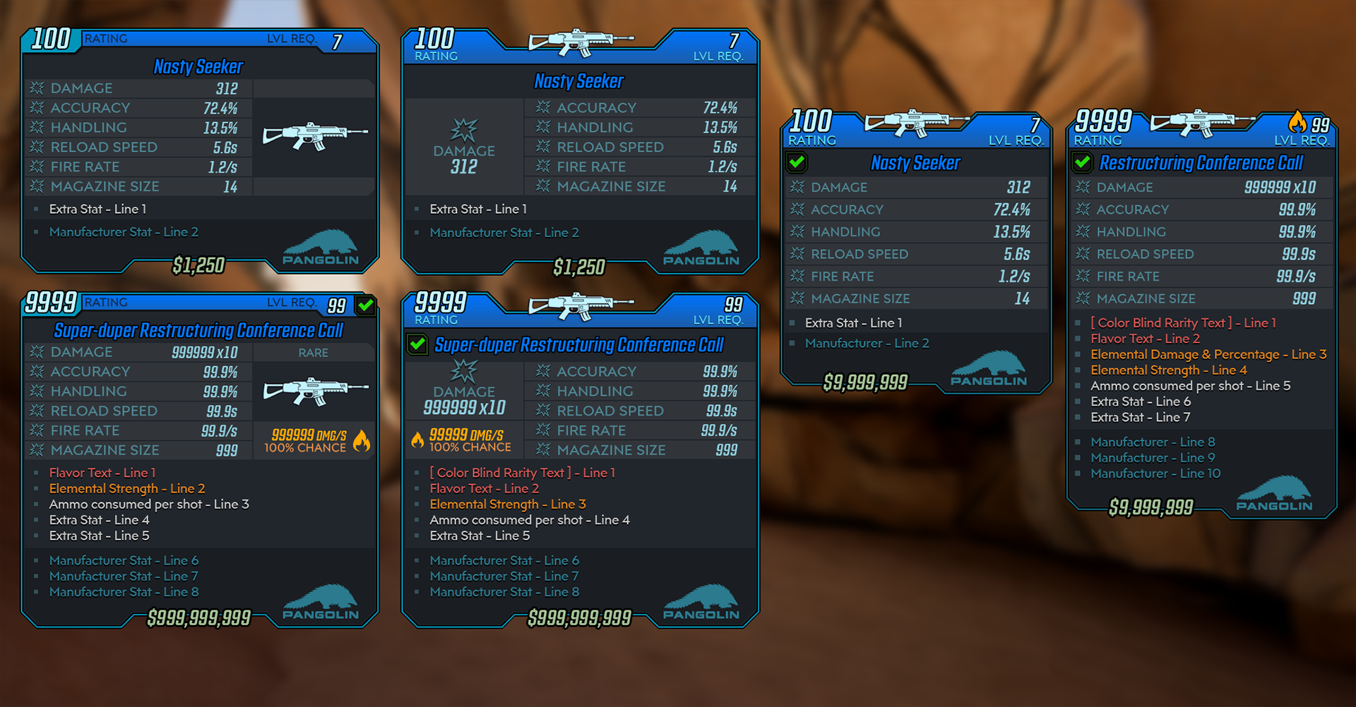
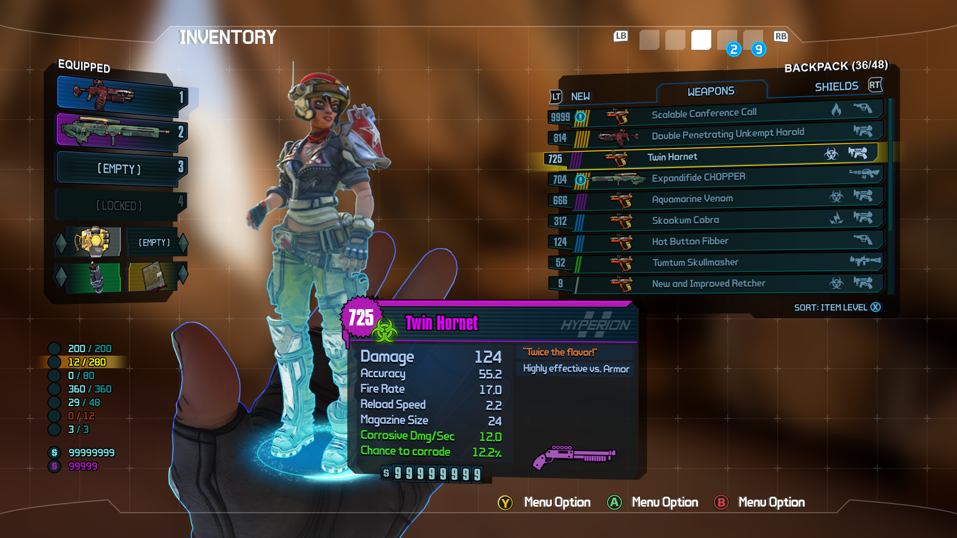
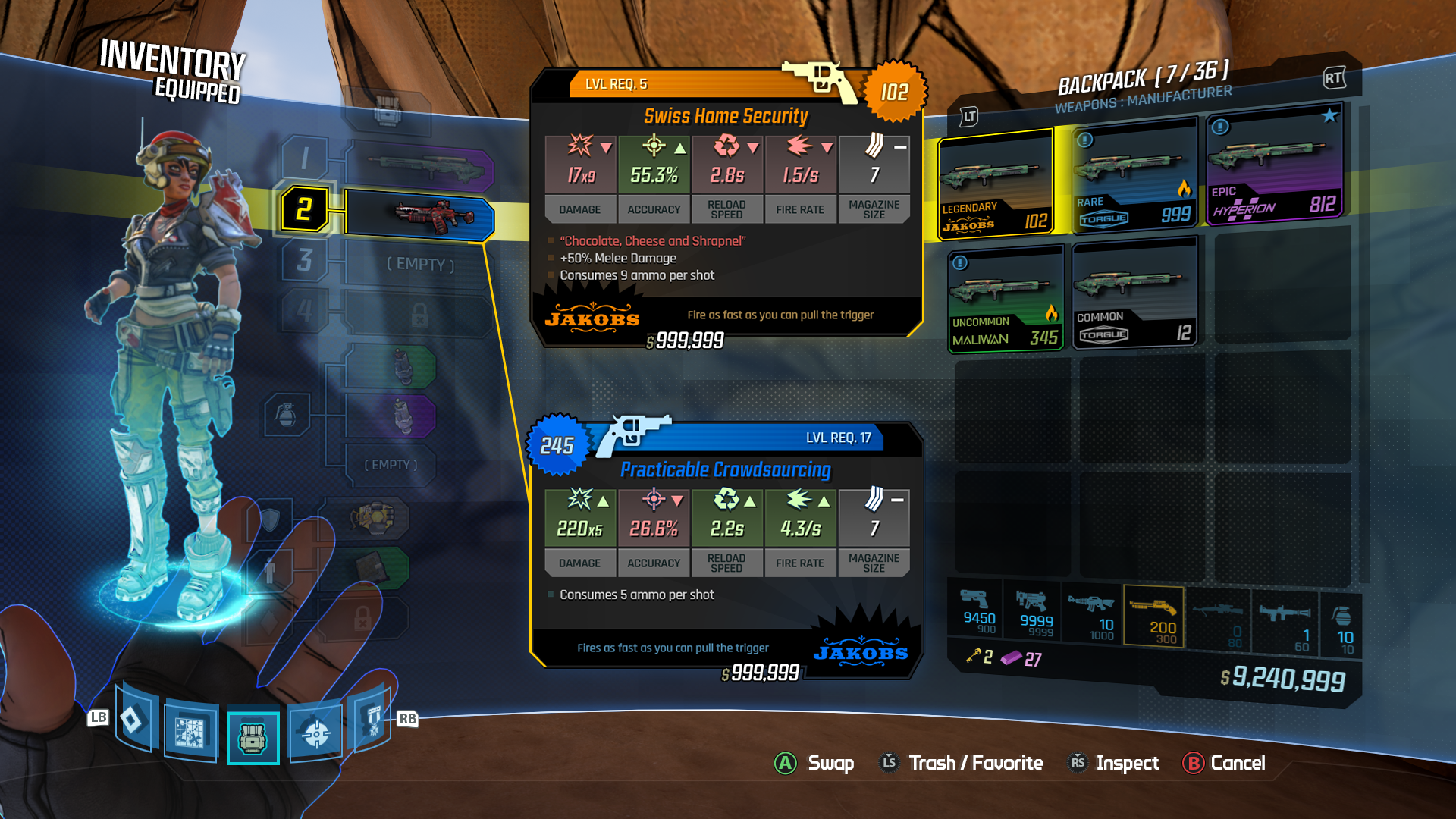
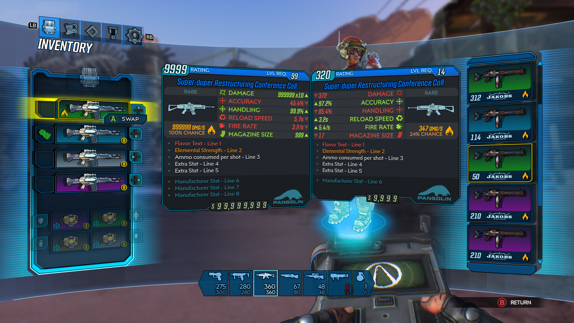
Item Cards were one of the tougher design challenges for Borderlands 3. There are significant stat changes between different pieces of equipment. And the card needs to be simple enough to provide players with an at-a-glance assessment of the item while being detailed enough to explain all of the gameplay implications of that item. This element also needed to be widely reused, moving from the in-game world to screens like the Inventory, Bank and Vending Machine.
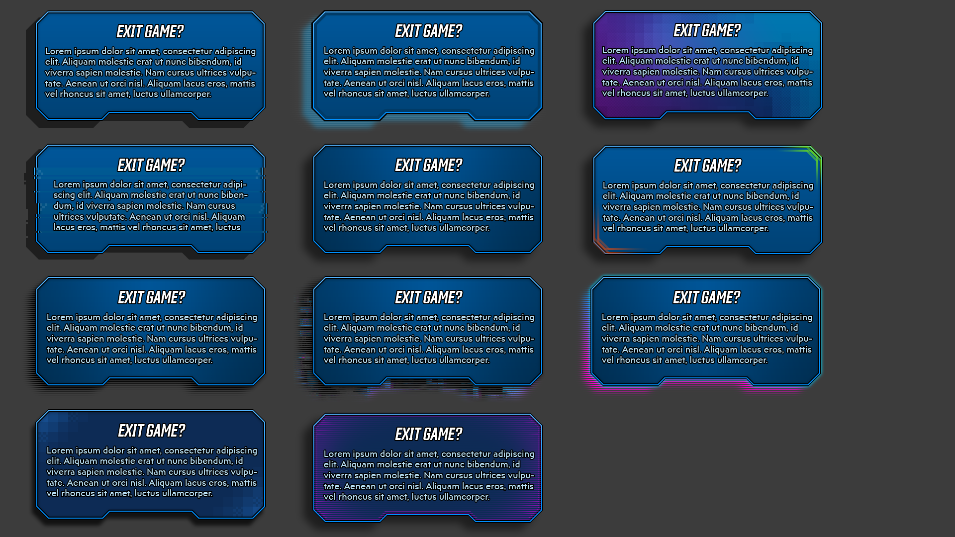
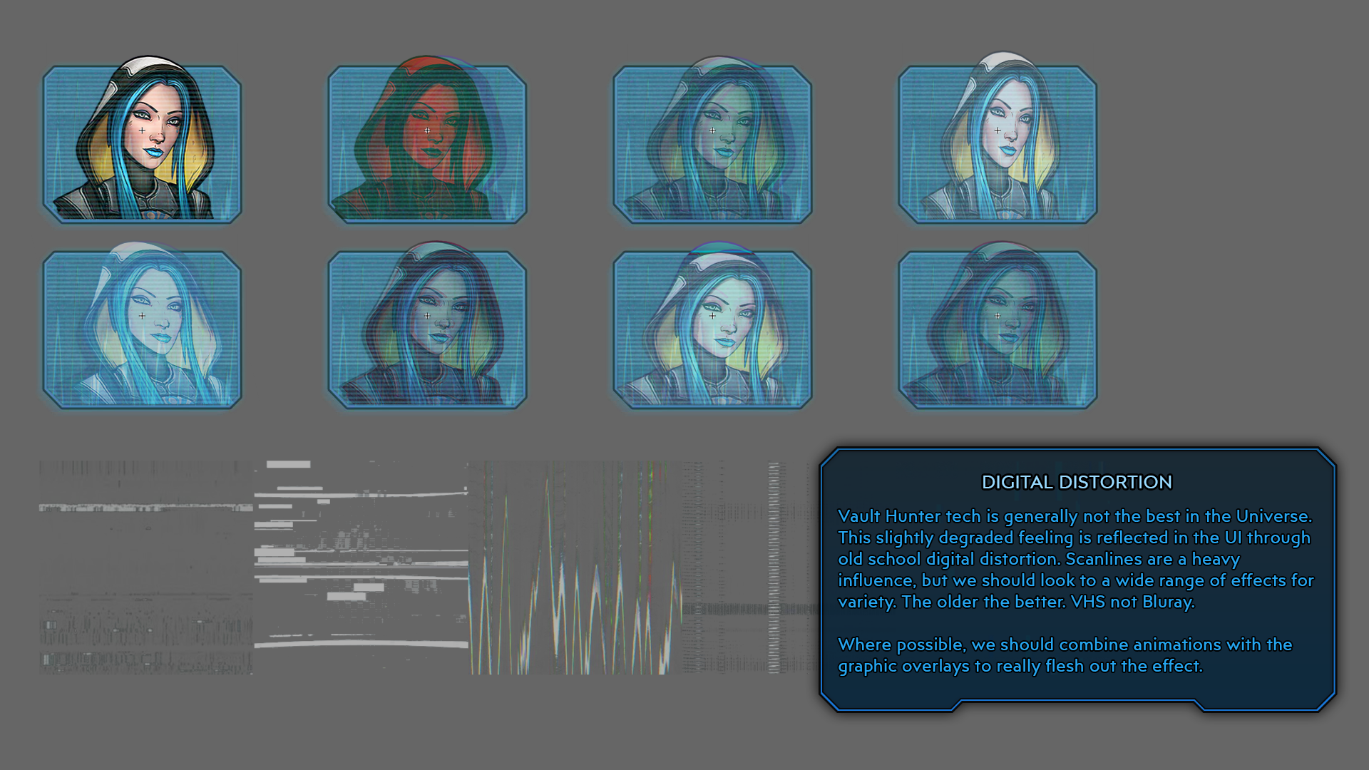
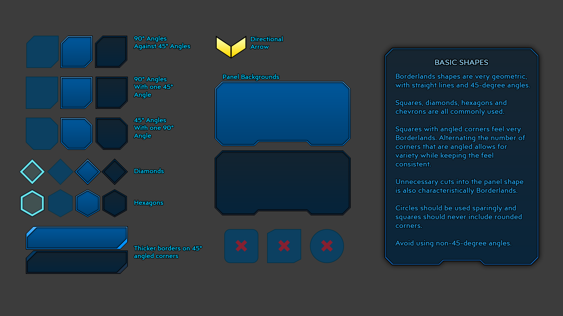
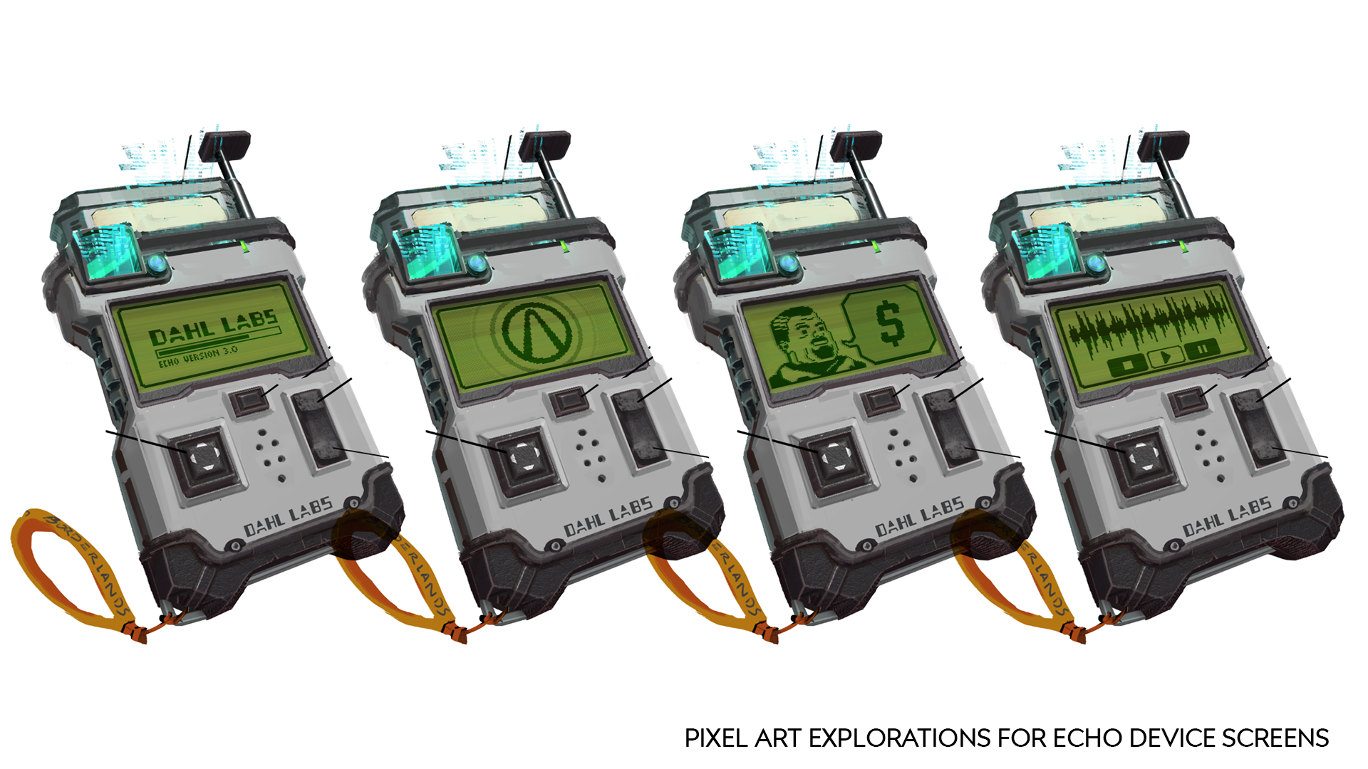
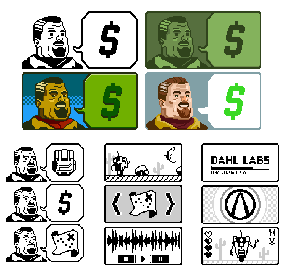
The style of the UI evolved quite a bit from the start of production. As a team, we frequently found ourselves adapting to design, narrative and tone changes as we went. These are some earlier designs, style notes and explorations that helped us move towards the aesthetic we eventually shipped with. We had to figure out things like color choice, shape language and what the digital grunge effects might look like. We also had a hand in developing the pixel-art screen aesthetic of the fictional ECHO device.
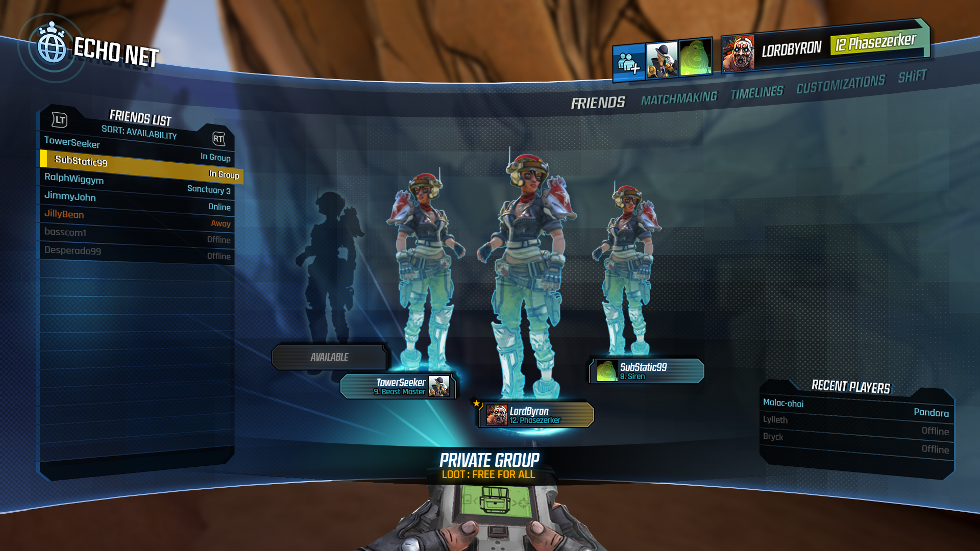
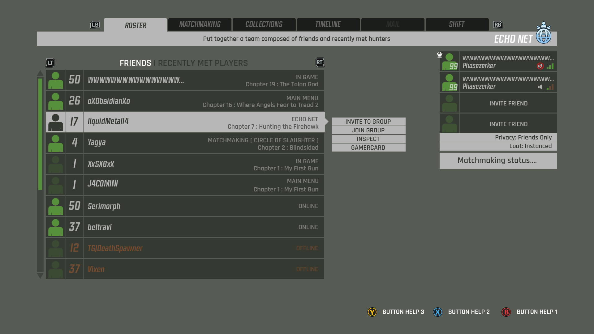
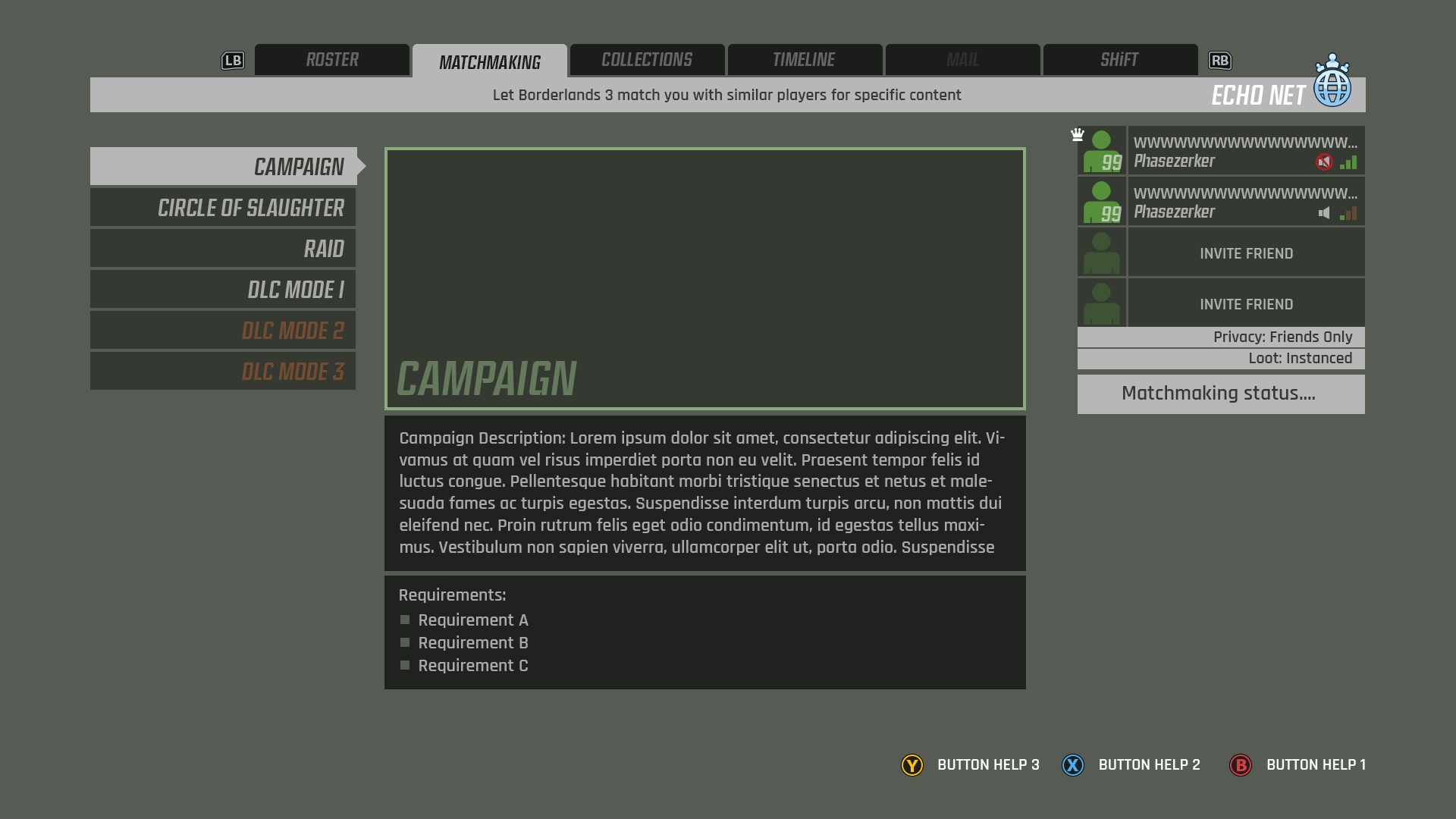
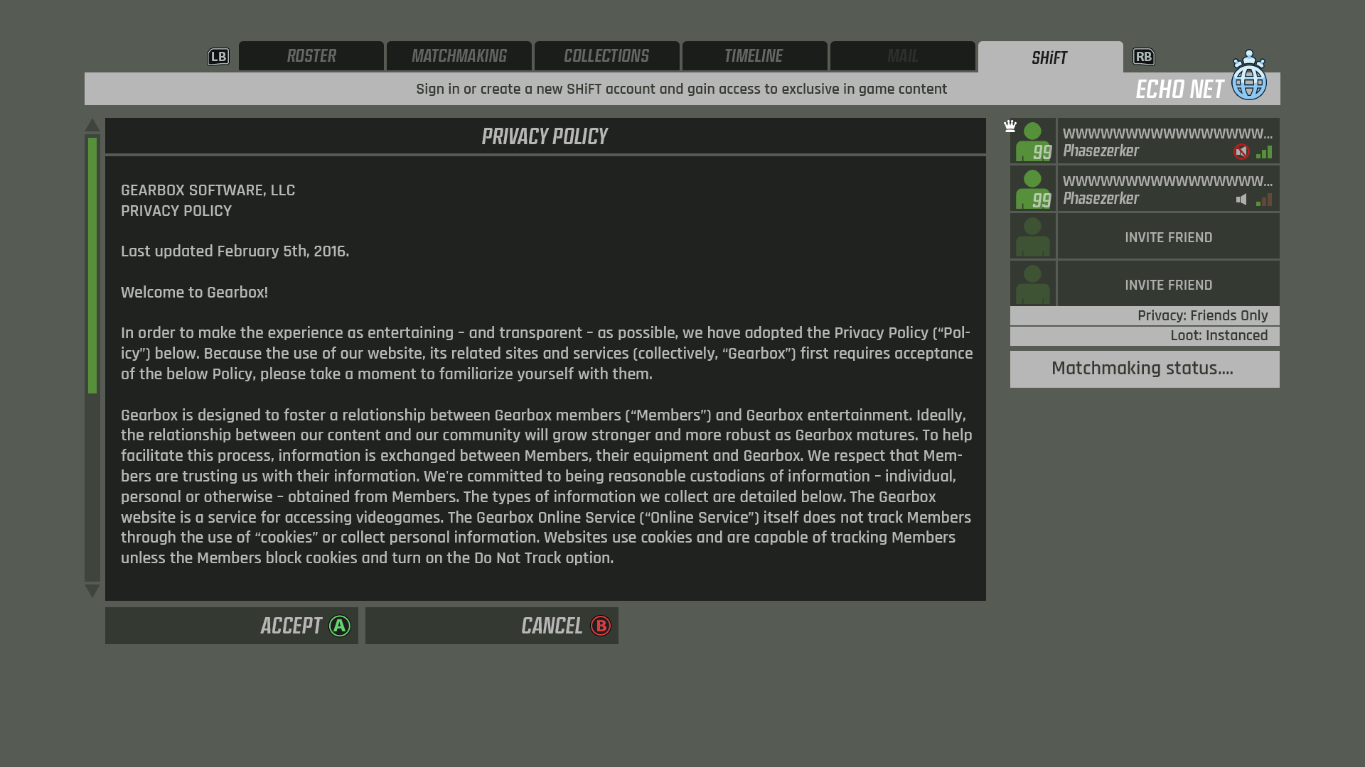
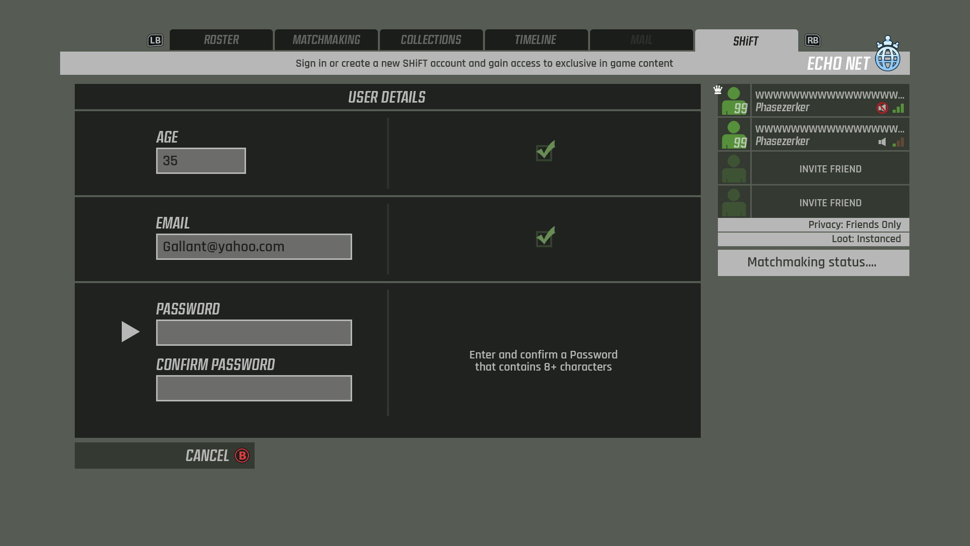
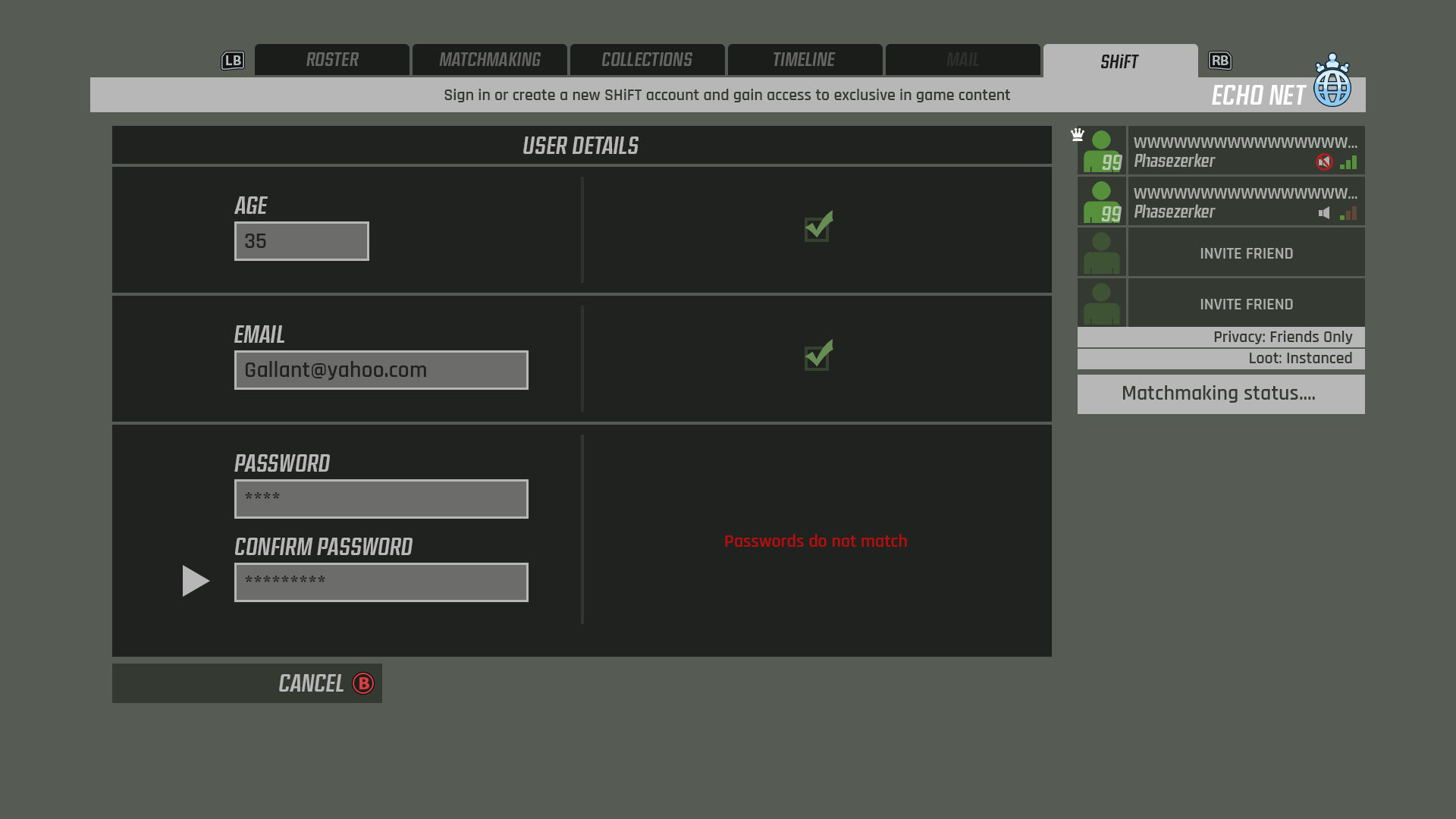
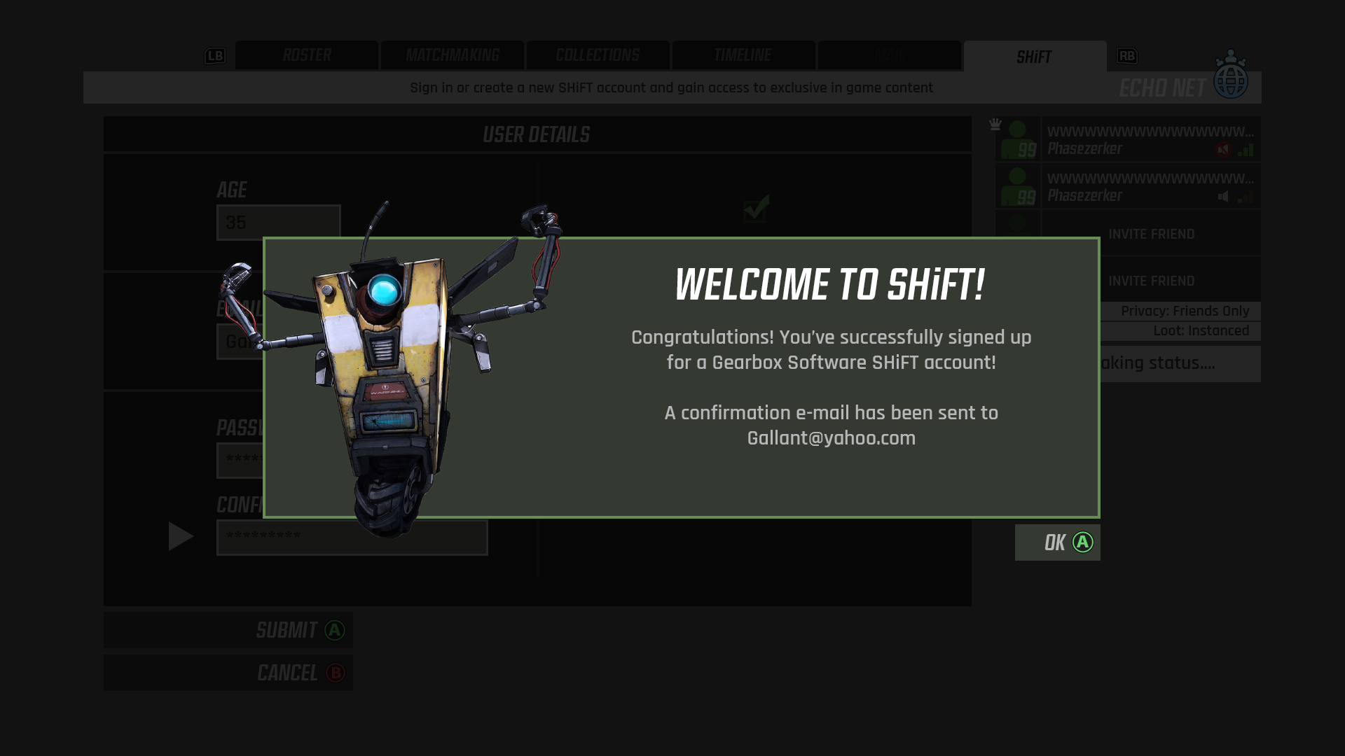
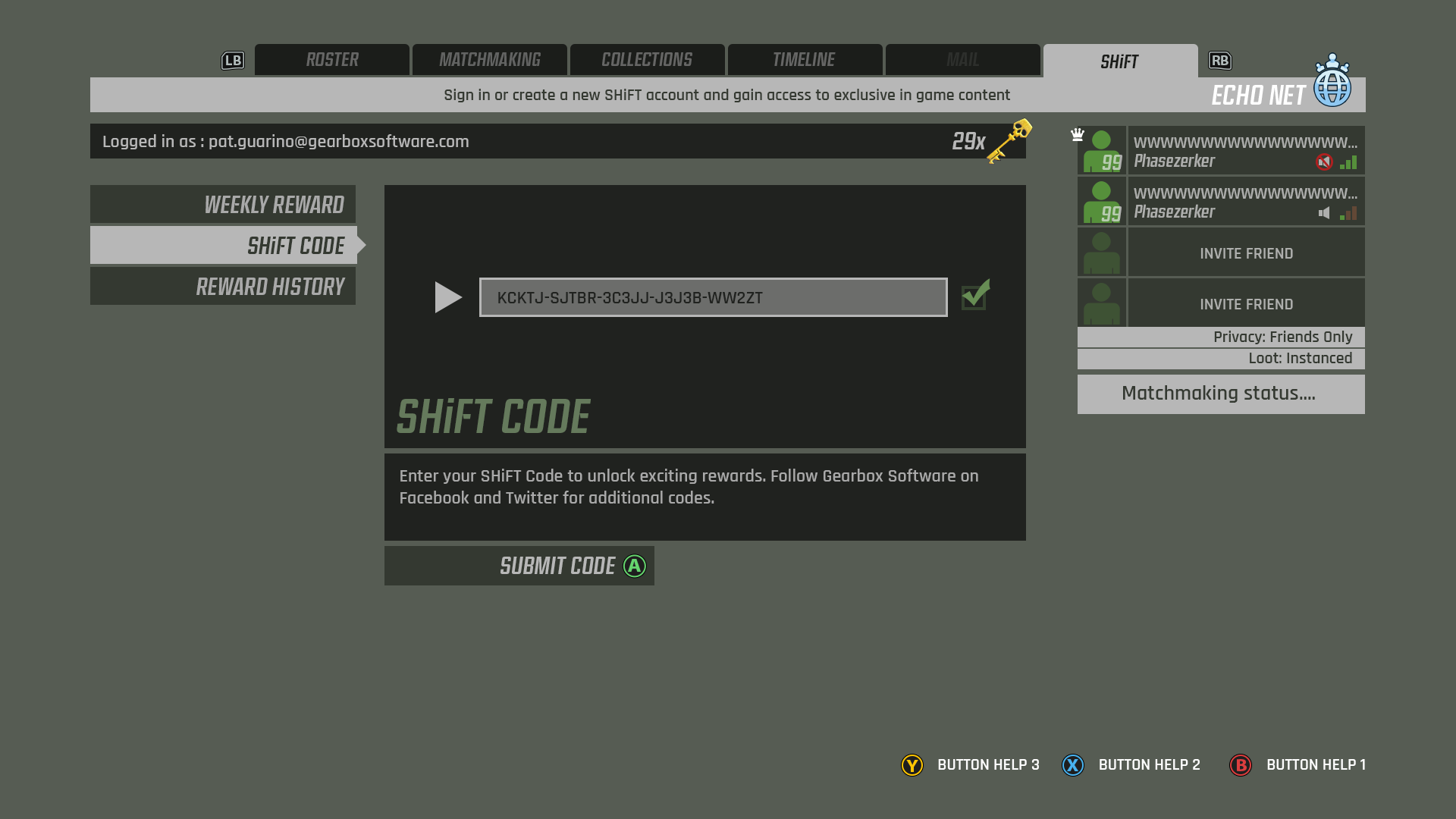
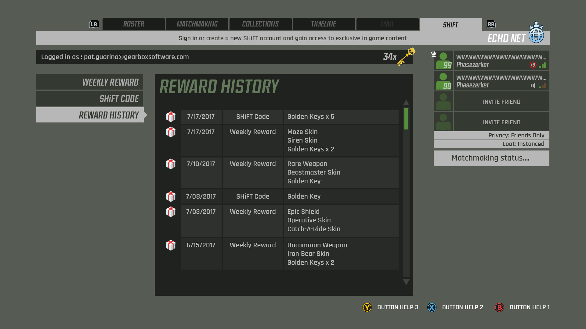
Early on in the project I spent some time wireframing an aspect of the UI that was often left until late in development: the online flow and SHiFT system. The versions that had shipped in previous Gearbox titles had been fairly clunky and needed improvement. These flows were an attempt to modernize the approach somewhat, and also ensure that we had considered all of the features required.